Translate

09 July, 2014

Kids cards

Because I have eight grandchildren, it seems there is a constant need for kids cards.  Some of these kids don't really care about cards, but some are very discerning and have high expectations of my creativity.
Eva is now 12 and has kept every card I have made for her and treasures them, but is not really crafty.  Grace is seven, and likes paper crafting and art activities.   Rhiannon is five and loves getting her hands on glue and glitter.  All my grandchildren (and children too) like getting interactive cards.
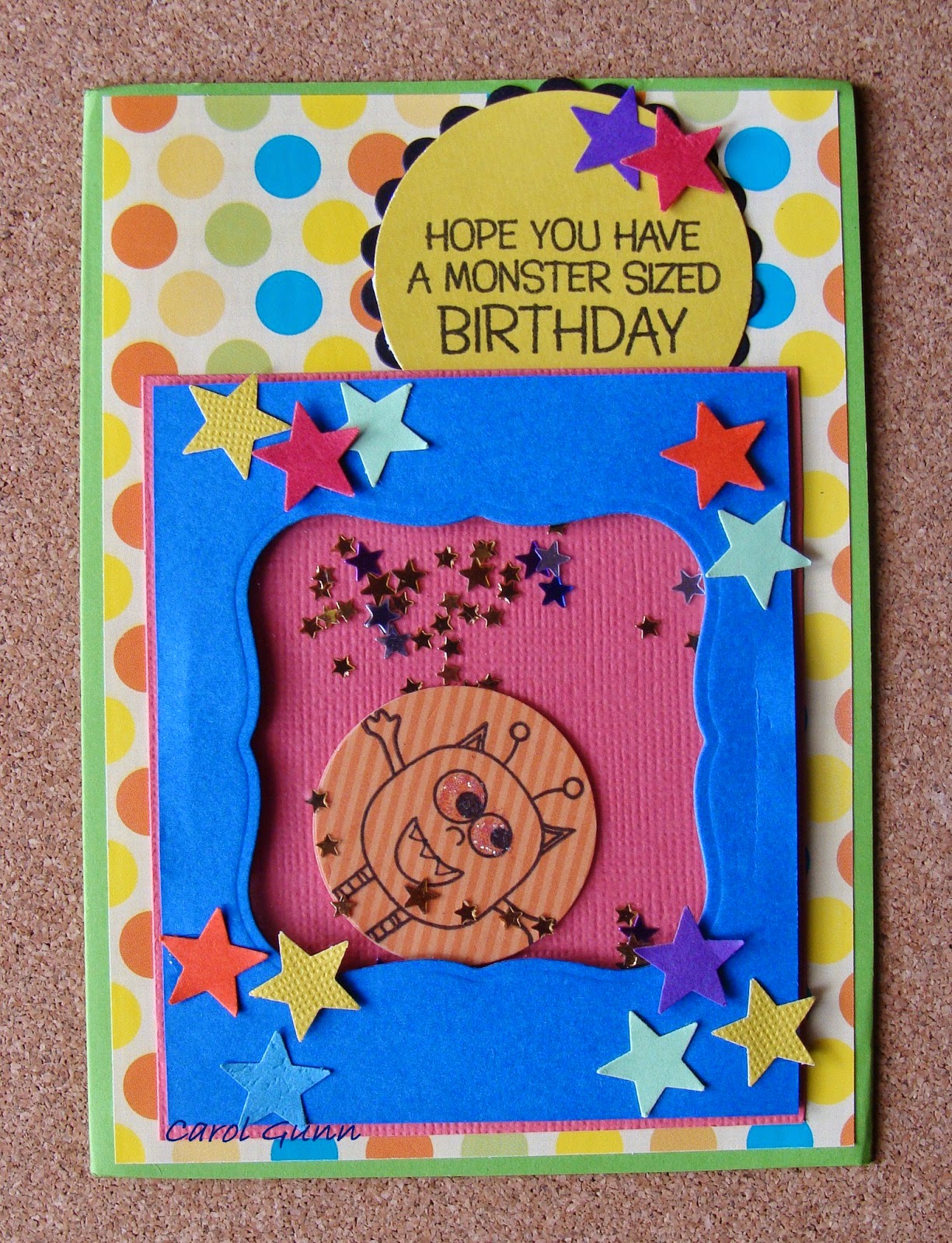


This is a shaker card, the stars and punched out monster shake around inside the window.


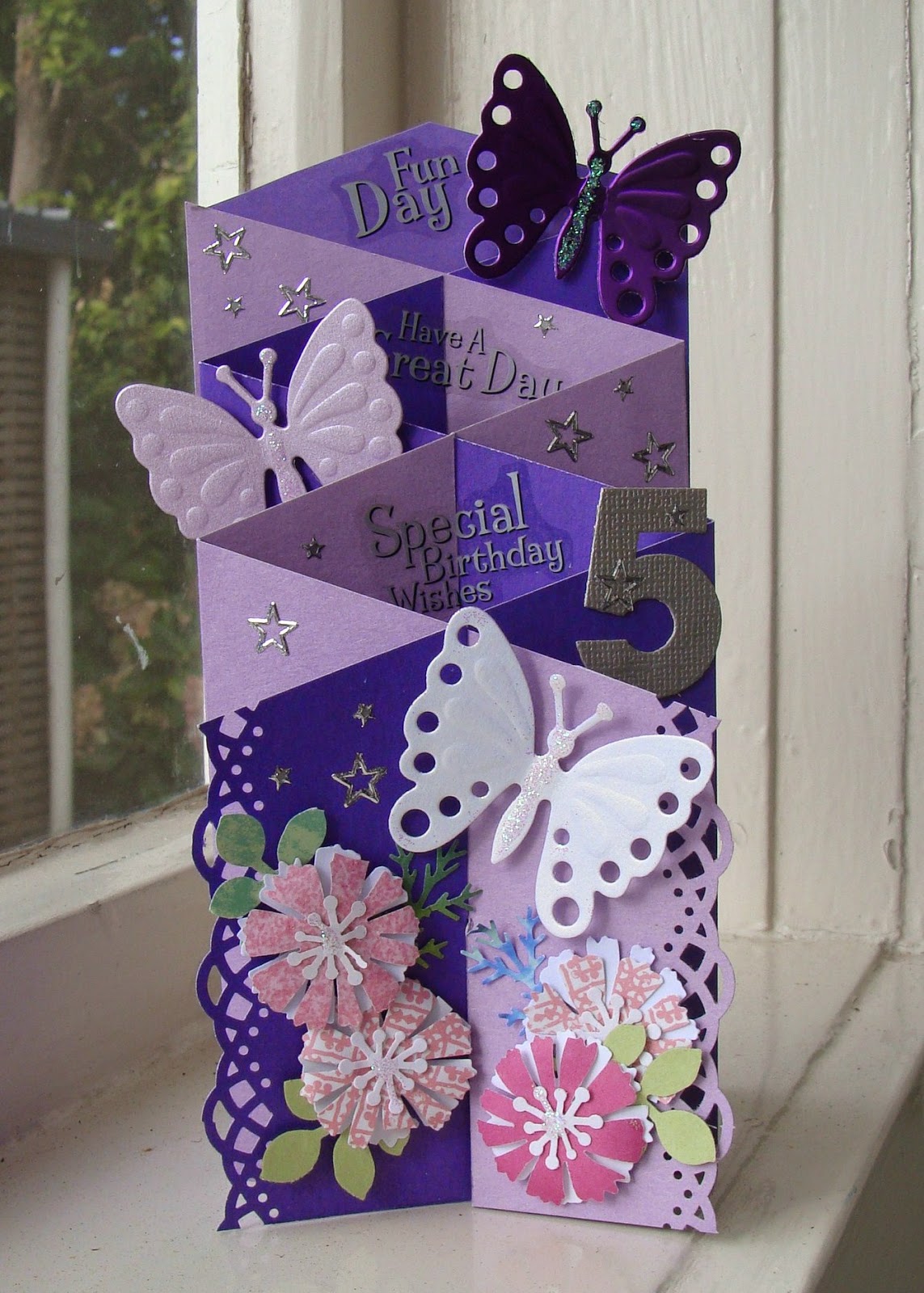
A double fold cascade is easy and gives lots of scope for decorating.  Grace's name is inside one of the folds for her to discover.  She is a butterfly addict.

I found kids love to have their name on their card.
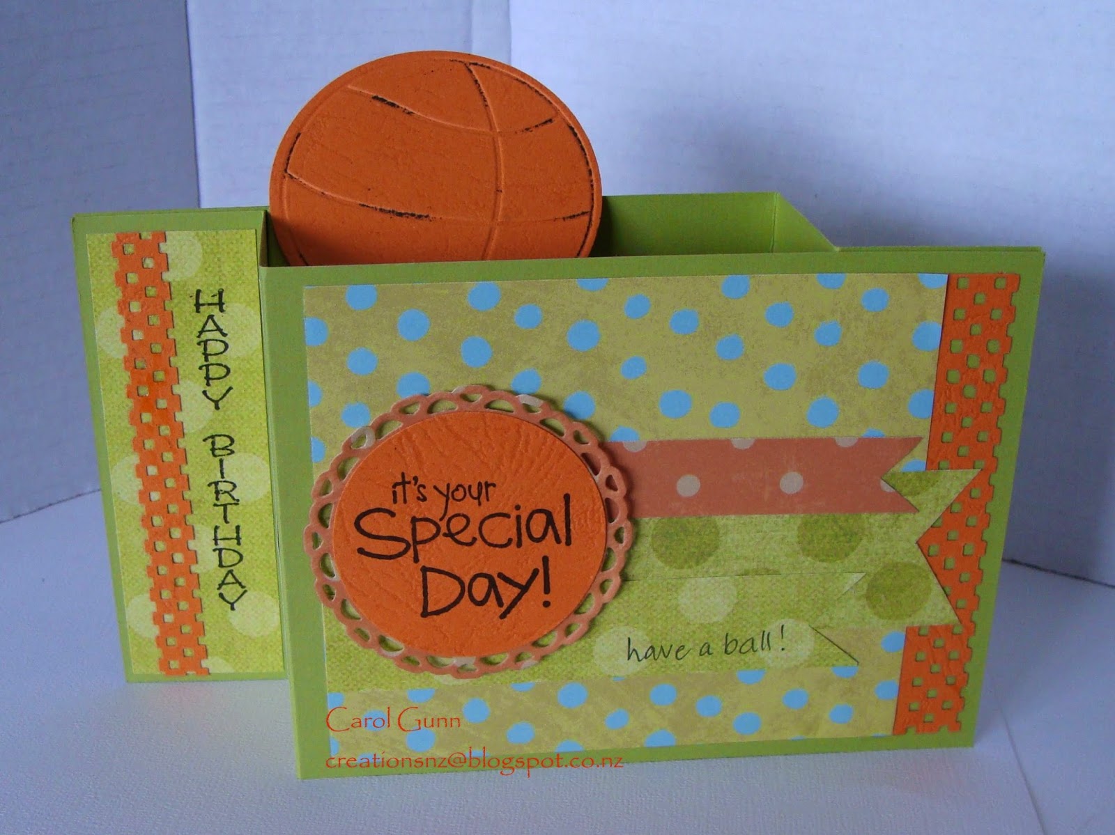


This one is a pull-fold with a pop-up ball.  We gave Eva a basketball for her last birthday which had been on her wish list for a while, so what better inspiration?  The sentiment says "It's your special day ... have a ball!"
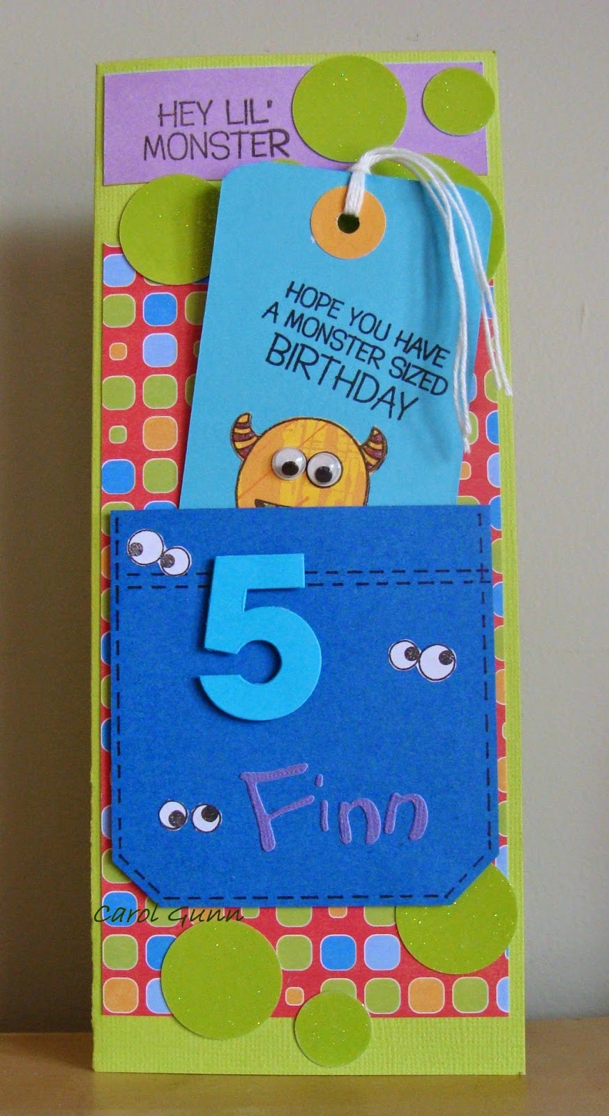


 For Finn, I did one with pockets, hiding tags and pull-outs with messages.  He hung the front tag onto his door handle after his birthday.  The insert inside I used a punch to 'eat' some of the page - like teethmarks of the monster.
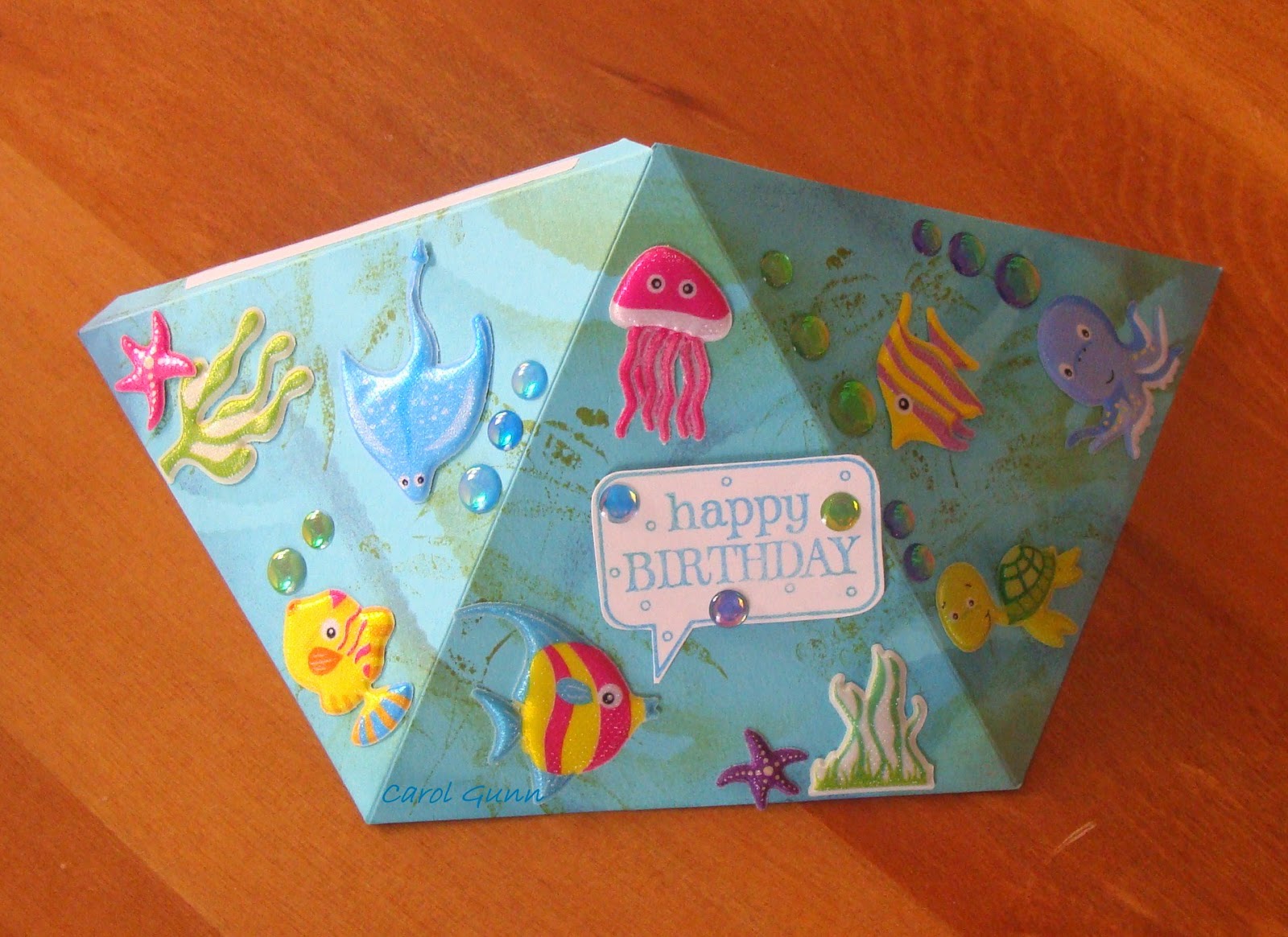


This one was a put-it-together-yourself aquarium shaped as a pyramid card for Jackson, except he didn't want to put it together and wanted it flat!  He says that way he can see all of it at once (no accounting for taste).  You can see the joining  tab at the side.  Well, I guess his card, his choice.  This can also have a string at the top to hang from and then it spins around.  The sentiment and messages are inside.  The stickers are like jelly.


These ones are called bendi-cards, and they are quite tricky.  This is the only one I have made (and quite probably the only one I will ever make), but the kids played with it for ages, telling stories around the theme.  The children inside the fence are making a garden, and down by the tree are other animals.
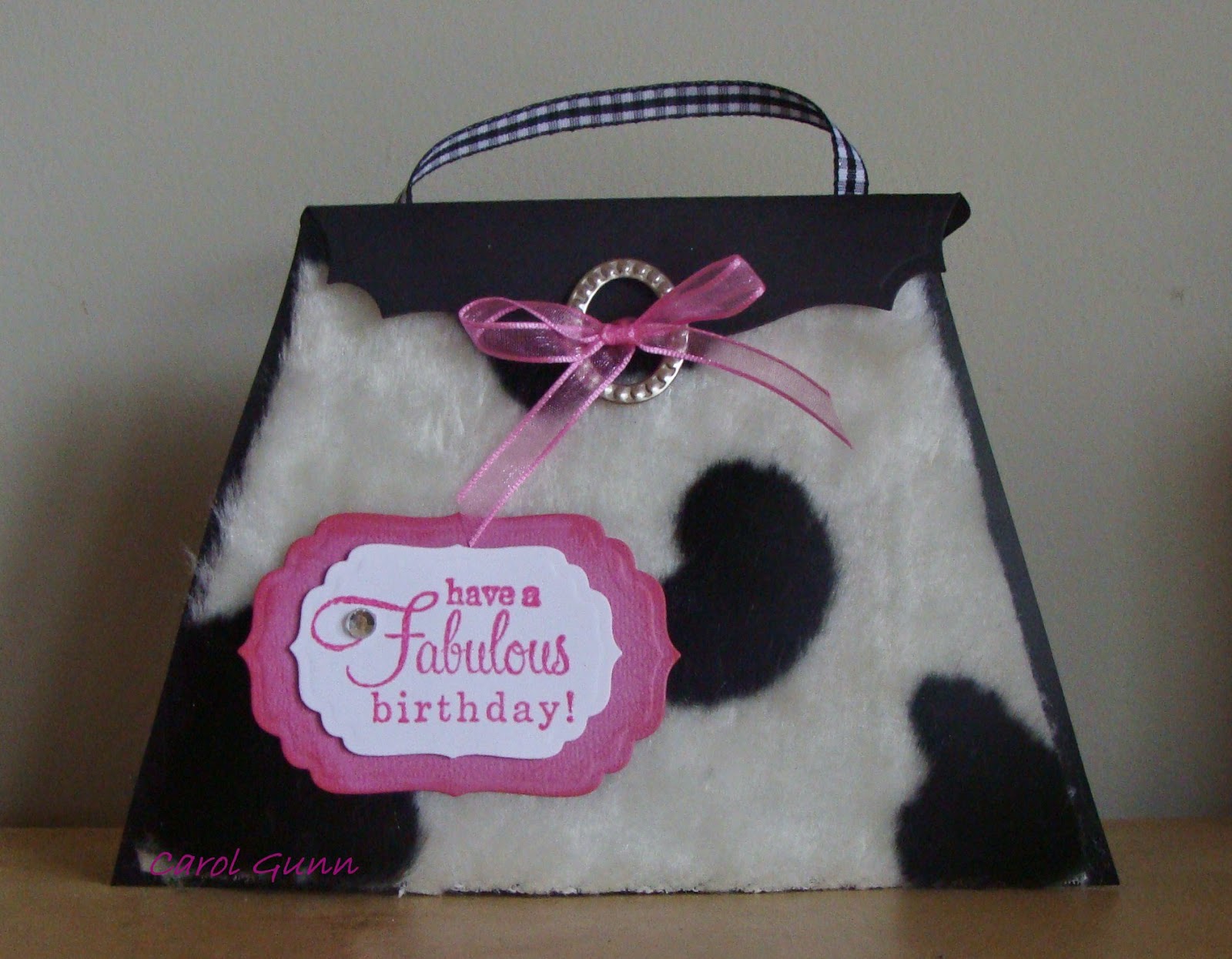


A handbag card with a gift card/voucher inside.  Very girly and what girl wouldn't want one?
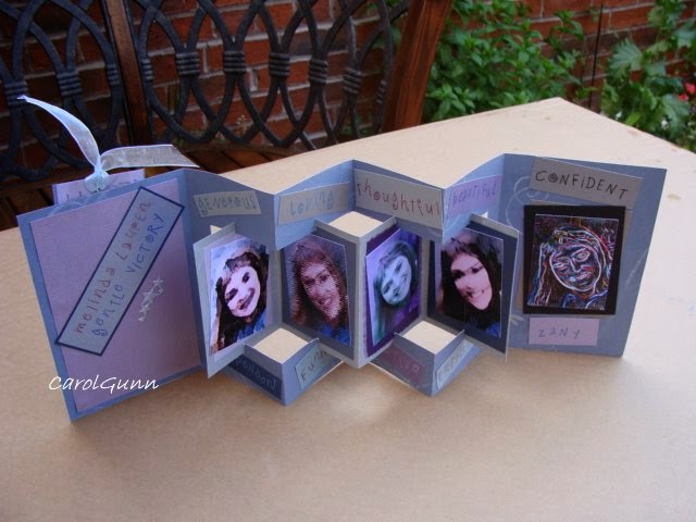


This was one for Lauren, our 32 year old daughter.  I took a photo and photoshopped the same photo in different ways with special effects. The I made labels on the computer with her special qualities and sprinkled them throughout the card.  Both sides have photos and qualities.  It also had a pull out tag in a front pocket.  She loved it.


A double diamond fold card for August, who is blind, so lots of folds, textured stickers, scratch n sniff etc.


It sure is a challenge to think about something new for each person and it is so great to have YouTube and Pintrest and all those tutorials available for our inspiration and education.  What did we do before all this technology?
Anyway, the important thing is - it's fun to make them and gives a lot of pleasure to the recipient.  Give it a go, why don't you?

23 May, 2014

Move over cards, come in quilts

Hi there.
Quilting is more than you might think it is.  It ranges from bed quilts, to art quilts, and accessories, and also from traditional to modern-contemporary.  Have a look and decide for yourself.

Over the past few months I have been concentrating on my quilting.  I have a lot of completed quilt tops known as UFO's in the quilting world - UnFinishedObjects.  Our local guild has a Biennial Exhibition in May so I decided to get some finished for that.
 I don't think I have a particular style, but it certainly is not hard-core traditional, and leans toward more contemporary style.  I love triangles in all their forms and am also learning more about stitching quilting designs.

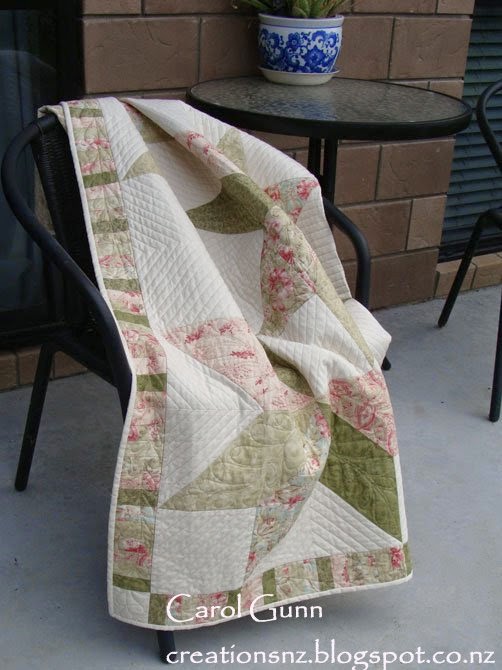
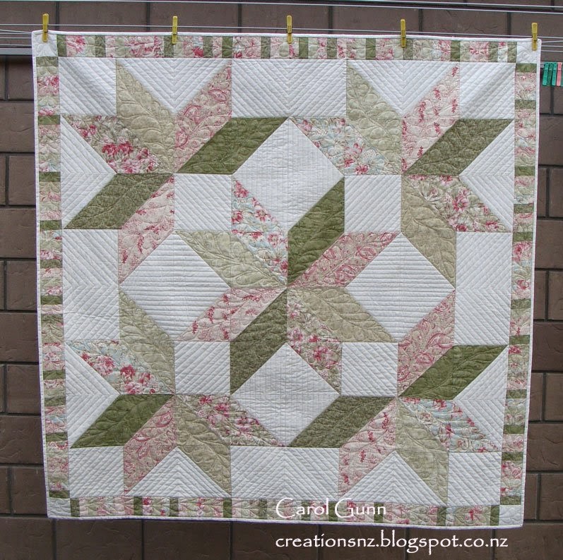
I made this quilt top while we lived in the UK (2007-2009) and this influenced my choice of fabrics.  I used muted colours because the light is different there, and it seemed right.  They are certainly not New Zealand colours.  However I really enjoyed working with these colours at the time.


For this one, I tried quilting designs  I had never used before like ruler-work and feathers.  I did a lot of un-sewing along the way, but am very pleased with the result.

Leaking Cauldron pattern.


This is called an art quilt.  It still has the basic structure of a quilt (3 layers of top, batting, backing) but is constructed with freedom from a pattern and uses various other techniques and materials as the supporting act.
This is called "A Walk in the Bush", and is inspired by NZ bush.  The underlying geology, water, flora etc is combined to create a whole feeling of NZ bush.

Entirely my own design.


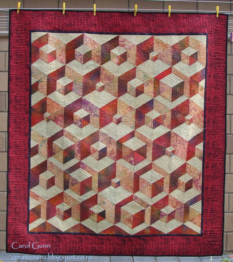
I made the top of this quilt and started quilting it a long time ago (maybe 2003 or 4) but only just finished it for the exhibition.
Originally I didn't even like it and put it away, I think mainly because they are not colours I personally like.  However I am glad I resurrected it.  The 3D image is really effective and I reckon it would look great in a building foyer where there is some space to see it properly.


Mary Jones pattern.


Sometimes we just like to do teensy projects after completing a big one, so I did some oven mitts for my daughter.

Martha Stewart design.


This is the second bed-quilt I ever completed.  I made it for my little granddaughter Rhiannon.  I like the off-centredness of this design which isn't too babyish and will still be ok when she is a teenager.
I guess the key thing for children's quilts is to make sure the backing is suitable for later in life, so it is able to be reversed when they grow up.

The techniques are piecing and applique.

I like this quilted handbag for dragging around my crochet projects, it sits upright and accommodates whatever shape is inside it. The wee triangles of colour are just there for "zing".  I love the bright lining too, it has inspiring messages on it and always makes me feel happy to look inside.

This is a pattern by a NZ company: Patches and Cream.


Another art quilt using batik fabric - Positively Purple.  This is kind of a free-cutting slice-and-dice technique it has patches of beading along some of the strips, which doesn't show well in the photo.


I hope this shows a little of the scope of quilting in the present.  Quilting is certainly not like it was even twenty years ago.
I like it when you leave me a comment, even if you don't like it.  Cheers, Carol.


28 January, 2014

NOT cards - January 2014

Anything but cards ...  albums, boxes and other stuff ...

Once in a while the other stuff shouts to be heard and even though it often uses the same materials as cards do, the result and the process may be quite different.

An album comes in many forms, from large to small, complex to simple. 
I have done a wedding album and didn't enjoy it very much, however I love the little accordion albums - they are my favourites!


This simple one was so I could focus on some positive things for the year, lots of goals, inspirational thoughts and reminders of the good life, after a stressful time...


... and this one, which is similar, has pockets along the bottom, to put samples in.  This is from a techniques class and each technique has been done on an ATC sized card for easy reference.  Each card has a description on the back describing the process.


Tags are another way of storing information and techniques or just for encouraging messages.  This is one I did for my daughter when she was struggling with the direction of her life.  Each side has an inspiring saying and are very tactile. I used lots of interesting textures such as handmade paper, vellum and tissue.


Jewellery box for men:
This is a balsa-wood box (very cheap at a discount store) which I covered with tissue (so it wrinkled) then painted with acrylic paint.  It looks like leather.  I added old poster clip art, diecut cogs, stamped slogans, gold leaf paper, and stick on brads.  Very manly I think, and my husband loves it.  Great for cuff links etc.  It is only 4" x 3", and came with that gorgeous clasp.


Boxes, both hard and soft always generate interest when containing gifts. I made a bunch of these at Christmas for giving cookies away.  Everyone loves a box with something in it. I could've just put the cookies in cellophane bags .. but hey, half the fun is not knowing what is inside!  I colour-coded the boxes so I knew what kind of cookies each box contained- everyone has their favourite cookie.

I used the Gift Box Punch Board to make the boxes.  The belly-band is Martha Stewart punch.


Another thing for a cute teeny gift are these TicTac wraps.  Sometimes I use the white mints and give them (especially to men) away at Christmas with the snowman poop poem on the inside. 
This one has Elfin poop with the fruity TicTacs.  I write the persons name on the front.
 
Rosette is Tim Holst diecut.
Pattern for wrap and poem from the internet.


Making things that aren't cards is a lot of fun and certainly extends that creative mind.  Have a go if you haven't already, I guarantee you won't stop at one!  Happy creating.