
This one has stamped footprints wandering along to give it some movement and a starfish made from homemade paper which is very thick and textured.
Doesn't it look hot and summery?
I like using black base cards and especially with bright colours as it seems to make them look even more intense.
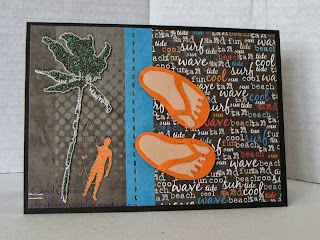
This next one is the other half of the paper I used above - you can just see the grey edge. The surfer and tree were already embossed on the paper, the jandals & feet are diecut (provocraft), and the strip is punched (Fiskars 'In Stitches').
One of the signature fundraisers for the surfclub is Jandal day - hence the jandals as a recurring theme. For those who don't know what jandals are, you may know them as thongs or flipflops.
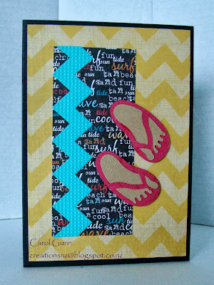
One of the great things about summer is the colour and intensity - I love the yellow and turquoise in this card, then just the pop of red to bring out the text.
The turquoise zigzag is using a strip embossing folder then cutting it out, the yellow zigzag paper is double sided with a really ugly floral on the other side.
You will notice the strips I have joined together - they are left overs! Use up tiny bits by combining them into something bigger.
The chicken netting die is Dienamics. To me, because of the colours, this one looks like it has a mexican flavour.
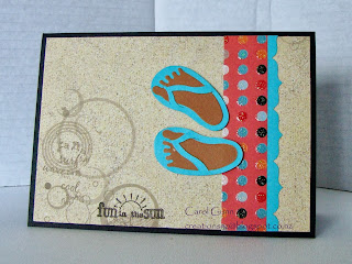
Beige can be dull or it can be something that makes other things look great.
In this one I used it as sand and to make the coral and turquoise stand out. I love that dotty paper which has some dots embossed and some not (I must remember that when I am doing my own embossing).
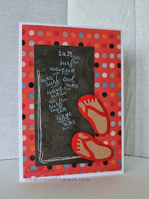
Hot-hot-hot and more of that dotty paper!
The blackboard looking paper was from another half and I just trimmed it so you couldn't see it was part of one of the other papers (who says we can't be sneaky?)
How simple is this?
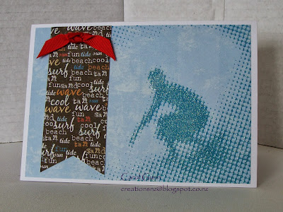
The one above is hot, this one is cool. The image is already embossed and says 'don't be too fussy', so this one I kept very simple.
Not much paper left by now. The text paper is banner cut and hung from the top with a knot.
I think sometimes we can get too complicated and forget that sometimes the paper speaks for itself, so we need to remind ourselves to keep it simple and fun, use colours and textures to tell the story. These sure do feel like summer to me.

No comments:
Post a Comment