Translate

13 June, 2015

Mojo401 sketchchallenge


Here is the sketch


and here is my interpretation:


I used  papers & card from my stash.  (All the colours are brighter in reality.)  Diecut clock sanded.  Blackboard sticker - I wrote the sentiment  in white coloured pencil.  Label is embossed, sanded, and edges inked. Star woven ribbon.  Star brad with inserted ribbon - still manly though!

If you like it , I'd love to hear from you.  Thanks for popping by.


Mojo401 sketch challenge

04 June, 2015

Mojo 400 Challenge


Mojo 400 Sketch Challenge.  Congratulations on 400 Mojo's!

Here is the sketch:


It is a simple sketch, but I knew immediately what I wanted to do with it:


I used Kaisercraft LeChateau papers throughout.  I turned the sketch around to accommodate the script on the backing paper. Distressed the edges of the circles, wet them, scrunched them and left them to dry.  The background paper had the script on it, but needed a little bit of something else so I stencilled the dots with versamark ink ... they kind of echo the dotty paper too.  Stuck the circles together, and then onto the card, trimmed the edge off.  Assembled a bunch of  toning beads on a ring, tied it with a bow.

Thanks for looking at my work; please leave me a comment if you would like to.


29 May, 2015

Challenges ... I love a challenge

Challenges
I love a challenge ... almost any challenge.  They usually inspire me, stretch me, and inevitably satisfy me.

Lately I have ventured into on-line cardmaking challenges - scary stuff when you're not that computer savvy.  There are problems with doing this, I should warn you now.  Once you start getting ideas, it's hard to stop... and next thing you know you have a stack of cards and are looking for the next challenge!
Here are some of them: 


This was a sketch challenge using a MojoMonday sketch on a DoCrafts site. My bird card.


then I tried a topic challenge: a Bear challenge with the birth of the new Princess in mind, and with additional instructions to be in two shades of pink plus another colour.  I wanted to make a card I could use so, still using the princess theme, came up with this one.  Light pink, dark pink and soft olive green.  I don't think I've ever used this combination before, but I like it.
 
This challenge was for a stamp/digital image, and the theme was a new house.  This is a Bugaboo image that I handcoloured with Reno Art pens.  Stamped sentiment and diecut key.  Of course it was such a graphic shape I had to cut the card in a house shape.


I won the sketch challenge with my bird card (see above), so get to host the next sketch challenge. 
I just love working with sketches so doodled a bit and came up with this one.  I always think simple is better because it gives a lot more latitude for creativeness.


and then here are my two demo cards:


This first one is what I consider a 'tight' interpretation which looks the same as the sketch.  The patterned paper is diecut, placed over layers of different colour card and the little doodle is a bird on a branch diecut.  Stamped sentiment.  The second card is a 'loose' interpretation which relies on the pattern of the paper to provide the stripes and layers and the diecut shape, while taking up the same space is not round.  The balloon supplies the 'doodle' in the sketch.


I also won the Stamp/Digi house challenge and get to host the next one. 
I have been travelling around a lot lately, so decided on something with transport as the 'hero' of the card.  Here are my two demo cards:


The car is stamped with sepia ink, with diecut corners and placed on  sanded embossed card ... makes a great mancard.
The other one is for fun, how would you like to travel on a broom?   I would ...  though I am waiting for teleporters to become available.

SO that's where I am at the moment with my work.  Please let me know what you think, critique is always helpful.  Cheers, Carol.

09 May, 2015

Mojo Monday sketch challenge 396

I love doing sketches, they really get the imagination going.    From time to time we all get into a NO-MOJO blank state and when ever that happens to me, sketches get me out of it into GO-MOJO.


This is the sketch for May  ...   and this is my card: 


Patterned paper with edges distressed, torn, rolled and inked.  Red base card stencil-inked on corner.  Image stamped on my own distress-inked and glimmer-mist sprayed paper, then heat embossed and matted on black.  Banners cut from black card and a bit of offcut from the image, one adhered dimensionally.  Punched black circle to give lift to the organza bow with dimensional tape.

Thanks for the sketch Julee.


18 April, 2015

Vintage memories

I love the vintage cards and layouts other people do, but this doesn't make it happen!  Many of my first tries were terrible but I hope things have improved along the way.


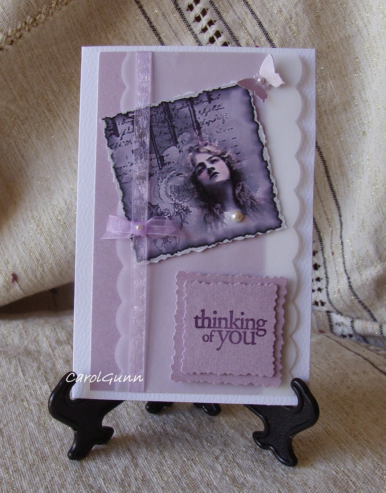
This is one of my early efforts.  I used a download from a printable shop for the image.  There are many different kinds available both free and for purchase.  If you like vintage style, a basic set often comes with say 6 or 8 to a sheet.
I like the colours in this one.  Initially I thought vintage had to be brown, but it doesn't have to be at all.  The purple card has a pearly sheen and there is vellum tucked in as well.

One thing I think needs to be mentioned is the stamps or font for sentiments needs to be of a suitable style that would have been around at the time.
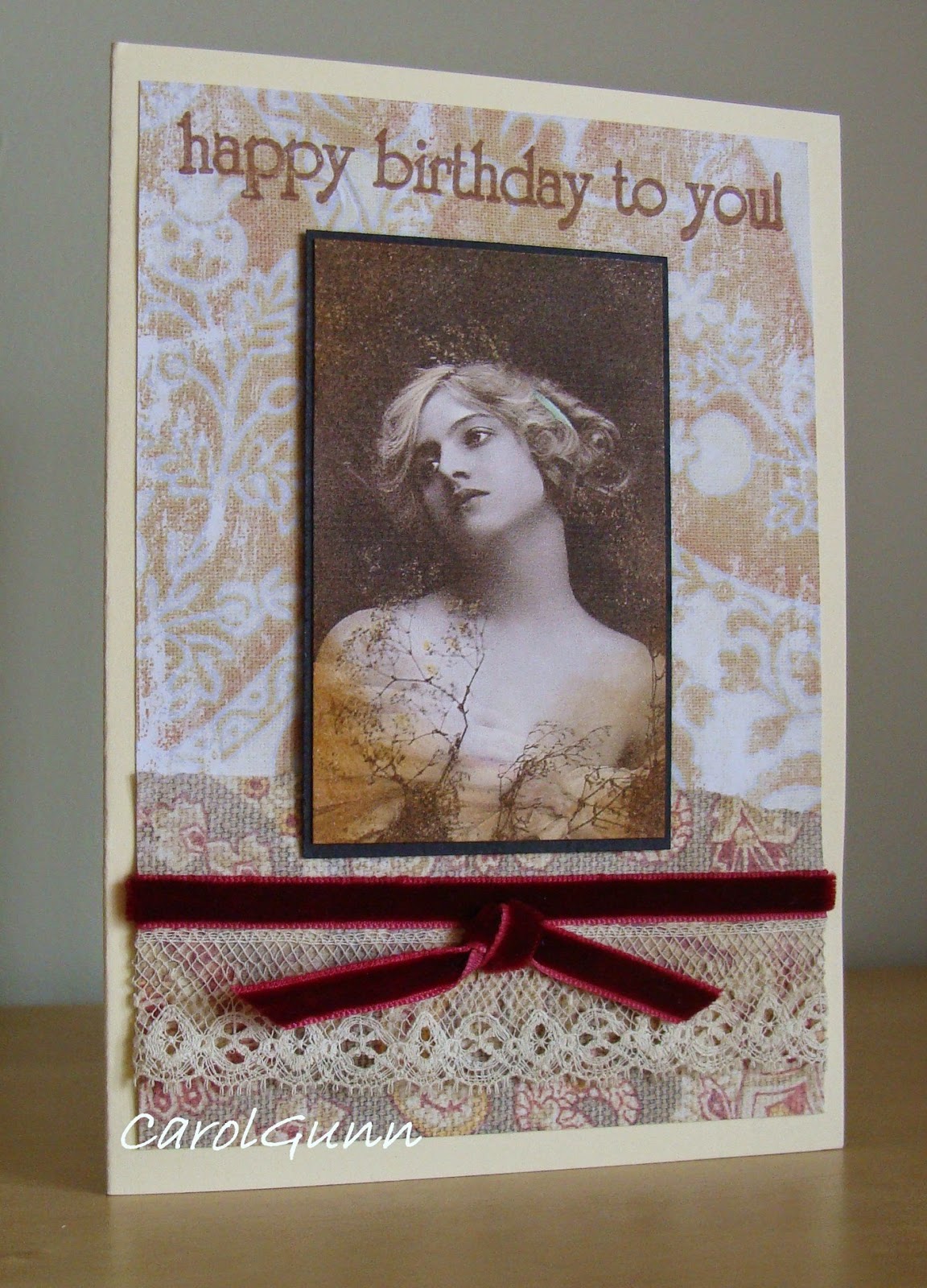


The trim and embellishments need to be appropriate too.  This one has a velvet ribbon and some vintage lace I picked up in a market. 
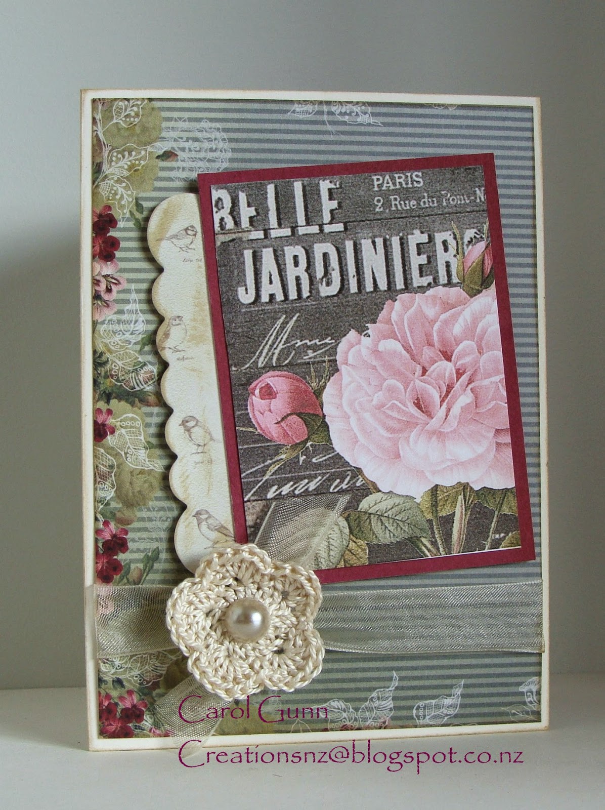


Subject matter varies a lot too.  Portraits of people to forms of transport can be found in sepia tones, but colour has a part to play as well.  I think we think of vintage as life being that colour in those days, but it wasn't - it was in full colour!


I wanted a flower to go on this card, but didn't want it to compete with the beautiful rose on the postcard, so crocheted a simple one myself, which I think added to the vintage-ness quite by accident.


I found the cups on some wrapping paper from a museum in UK and used it as the feature for this card. 

The brightish pink was quite a common colour in those days for ladies dresses.  A tiny doily behind the sentiment adds to the teatime theme without being too obvious.


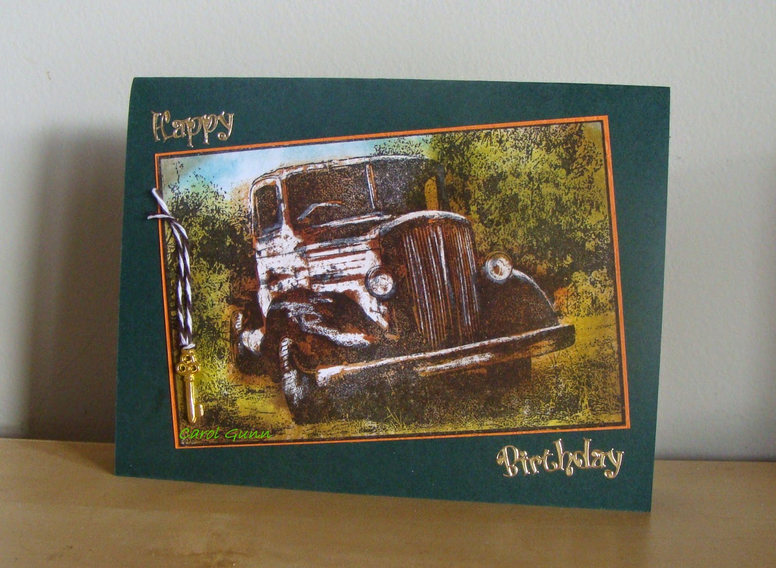
Old cars are a favourite for men's cards.  This old truck uses a wax crayon resist to highlight parts of the truck, and is then coloured with distress inks in a similar way to the old hand-coloured photos.


Some baker's twine and an old key add a little bit of touchability.


This image is stamped with sepia ink and the edges inked as well.  The embossed background is sanded for a rustic look and baker's twine tied around.  The photo corners were put on so it looked like it was in an old album.


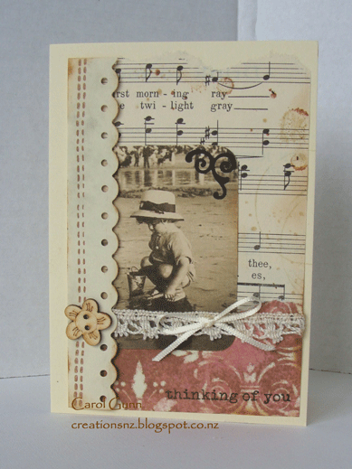
There are many papers now that coordinate beautifully with vintage images.  I particularly love using script (either in papers or stamped), old ledgers, music (stamped or real old pages), and papers that look like old wall paper.  This one has the script, ledger and wall paper looking papers.


Finally what about the children? 


I love this stamp of  daddy and his little girl.  Lots of texture here with the black corrugated card, heavy hemp string, and the old looking label.


In this one I added blots and age marks to the old (real) music sheet, tore the edge a bit, and inked the edges.


Really, there are so many images around like clocks, watches, biplanes, sailing ships, typewriters, gears and cogs, pens, feathers, and old embroidery scissors, to mention a few.


I wonder how long it will be before computers join the list?  


Have a bit of fun trying out vintage themes.  And I'd love to know what you think of these.

26 March, 2015

What is so special about autumn?

Autumn is coming to the southern hemisphere.  We have had a wonderful long, hot summer but it is nice now to think of a little rain and some of the other lovely things that we only do when the weather is cooler.


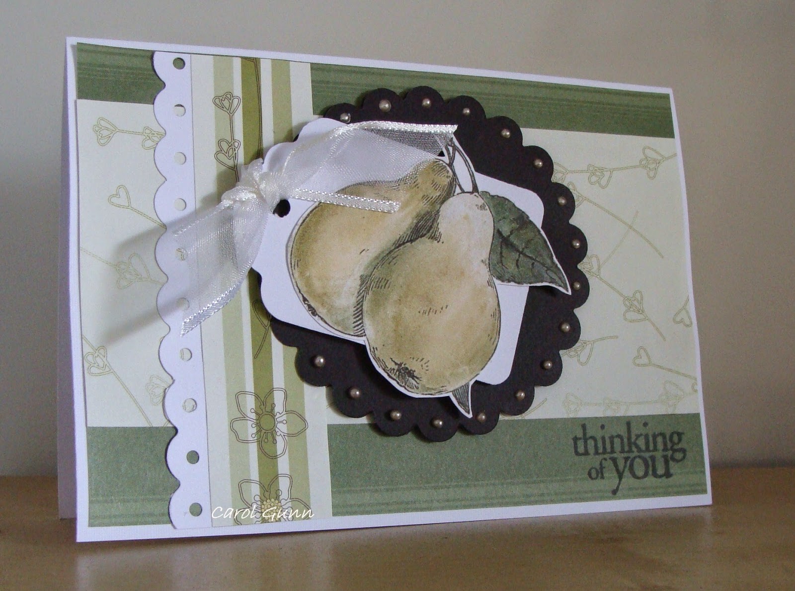
One of the things I love about autumn is the fruit.  Fresh pears are probably one of my favourite fruits along with raspberries and mandarins. 


While it is still pretty hot during the day, I notice the nights are getting cooler and the liquidamber trees are starting to get that purple tinge to their leaves, that deep aubergine colour that is like no other.


I don't know about you but I love nuts too, almost any kind but especially cashew, pistachio and macadamia nuts.  Nuts always remind me of autumn.
Their wonderful textures and different shapes are so inviting that you have to just grab a few and nibble, not to mention all the other dishes they go in ...


I accidentally discovered leaf skeletons as an adult and wished I'd discovered them as a child.  Somehow they seem magical, almost as if the leaf has gone somewhere else - a bit like when a cicada sheds it's skin - and leaves behind a reminder not to forget it.


This one is made using a real liquidambar leaf (I think they are also called sweet gums) used as a stencil.  I rubbed over distress inks then sprayed glimmer mist before stamping the sentiment in the soft subtle green.


And these are using real gingko leaves, versamark-inked and heat embossed with copper embossing powder.  They are a simple shape, but are stunning all the same.   When they are inked and stamped they remind me of ballerina skirts made from tulle.


Such a variety of leaf shapes too, that you don't tend to notice so much in summer.  Look at not just the leaf margins, but look at the wrinkles and crinkles and insect-eaten bits and think of all the life that is encapsulated in one dying leaf.  In the space of nine months it has developed from a tiny bud, grown and stretched and danced in the wind and provided food for the tree itself, and now grows smaller and it seems is trying to curl up into it's smallest shape again.
 
So look around for the shapes, colours, textures, smells and foods of autumn - they are what make it a special season, freely given for our pleasure.

28 February, 2015

slider card


Easy Slider Card
The finished card was shown to me by Trish at Hastings Rubber Stamps, Hastings, NZ. January 2014

Decide how big you want your card to be.  I made it to be the same size as a C6 when it was folded and assembled.
SliderCardno1W.gif

Outer Tube: Cut your card double the size you want to end up with, plus a bit to overlap.  Score & make into a tube, ensuring the overlap flap is hidden inside the tube.


Pull insert: this needs to be slightly smaller all round than the outer so that it fits inside and pulls easily.  Cut a sturdy layer of card, decorate if wanted.
 
SliderCardno3W.gif


Assembly:  put the insert into the tube and punch a hole through all layers at one end, in the centre of the end.  Take insert out and reverse it into the tube, lining up the holes.  Put a long piece of ribbon (about 3 x length of tube) through both tube and insert. Pulling  the ends up to the other end of the insert.
 
  
SliderCardno4W.gif


At this stage decide if you want to punch another hole or just tie the ribbon around the end of the insert.  (I glued it at the end so it stayed tied).  Then push the insert into the tube, in, out, in, out....

  Decorate however you want.  Decorate front of insert with sentiment or whatever you want, remembering it needs to be quite flat to slide properly. Leave a space on the back of insert for writing a greeting or message.


The insert is pulled in and out using the bow.
Have fun.

28 January, 2015

soft canvases

Most people would think of quilts as being cuddly bedcovers to snuggle up with.  Not so.  They come in all forms now from soft furnishings and clothes to art pieces.   Our local museum has commissioned and hung a large artwork made by one of our local guild members in their entry foyer .


I have dabbled  and tried out various things in different styles.  Here is a wee selection of my wallhangings.


This is my current favourite.  It uses raw edge applique, chenille, and beading.  The message says "She heard the whisper over and over again - breath in, breath out".  It won 2nd place at the Craft & Quilt Fair in Hamilton 2014 - "My Favourite..........place to relax".

What you can't see is the birds,  yachts and woodgrain quilted into the background ... and the glass of white wine in my hand!  The sea is made with shantung, feet with fossil fern and batik fabric.  The white surf is beading.


This is a wall hanging made in only two fabrics: a purple marbled batik and a peacock print.  Clusters of beading embellishment wander across the panels.
It hangs in three separate panels which are joined at the top.

I really like the asymmetric shape and the curves.


This is an abstract design quilt attached to a canvas frame, with piecing, chiffon inserts, yarn, ribbon and beading.  It was lots of fun to make.


The Angel of Virtue is a stitchery quilt done in blue floss thread - a
modern design in a traditional style. 


Stitchery is quite relaxing technique and is easily carried around.


This is another raw edge applique piece mounted on a canvas frame. For this one I tried out a printing technique using tissue paper on the computer to do the lining of the shoe (with words relating to shoes) and the message: "every time she put on her red high heels she felt like dancing".  It was also for the challenge "My favourite....ever shoes " at the Craft & Quilt Fair held in Hamilton 2015.  It is interesting that I had these shoes in the early '90's and my kids still remember them too!


I hope you look out for other ways quilting can be used, such as clothing, bags, home furnishings, and ornamental items such as bowls, vases and constructions, and probably many more I haven't discovered yet!