Translate

09 July, 2015

sketch Mojo 405


This is challenge week for Mojo sketch challenge and because I love sketches here is mine:

and the sketch:


I like the clean and simple style but not too severe.
Here I have embossed the red card with Sizzix brick EF and lightly smooshed some Black Soot Distress ink to dirty up the brick pattern a bit.  Arranged the BoBunny arrow stamps in a line (hopefully it reminds you of graffiti), then cut the red card to meet the shape of  the sketch along the arrow line.  Sentiment "You Rock" inked in black - Fundamentals stamp.  The round shape is top of the tree, die cut the Lucky Tree, stencilled with distress ink in shades of green and tied fine string around the trunk for the little detail, adhered with dimensional foam.
I appreciate your visit, thanks for any comments.

Shared challenges on: http://mojomonday.blogspot.co.nz/2015/07/mojo-monday-405-contest.html


08 July, 2015

for the boys

I always need boy/mancards and I love to think up new ways to do them.


Braden loves soccer so I made a pocket with a stamped paper pieced boy on it, and stamped the same image on a tag for him to colour and hang on his door.  The tag goes in the pocket.

Boy image is Papernation Stamps.  Diecut name letters and stamped number.  Faux stitching around the pocket with a pen.


shared on:
http://thepapershelter.blogspot.ca/2015/07/challenge-210-for-boys.html

07 July, 2015

dotty yum


Oh Yum.  Dotty heaven.

Cupcake stamp is HeroArts using versamark ink, adhered with 3Dfoam.  Diecut doiley. Punched heart from thick sparkle card, adhered with deep 3D foam.  Stamped sentiment on diecut tag, ribbon.  Gems for sprinkles.


What a great recipe for a yummy card.

Hope you will leave me a comment, thanks for popping in.


Entered in: 
http://www.simonsaysstampblog.com/wednesdaychallenge/simon-says-were-going-dotty-2/
http://www.lovesrubberstampschallenges.com/2015/07/challenge-159-anything-goes.html
http://cinspirations.blogspot.co.uk/2015/07/challenge-320-anything-goes-option-of.html

dotty celebration


Going dotty when you celebrate your 60th is ok!  This one is for my friend who is a long way away.  I used the dots to make it feel like confetti and the bling to make her feel like a star.  She is the blonde one in the middle.  These girls know how to celebrate, right?

Art Impressions Girlfriends stamped with Versafine ink and handcoloured with watercolour crayons.  Diecut circle, stamped sentiment heat embossed with black sparkle cut into banner.

I hope it makes you feel like you're at a party!


Thanks for looking and commenting.


Entered:


http://www.simonsaysstampblog.com/wednesdaychallenge/simon-says-were-going-dotty-2/
http://www.lovesrubberstampschallenges.com/2015/07/challenge-159-anything-goes.html
http://cinspirations.blogspot.co.uk/2015/07/challenge-320-anything-goes-option-of.html

dotty treat


I love dots and stripes so what better than a cupcake with dotty paper for the sprinkles? And a punched dot for the cherry on top?

I cut out the shape, then added pink paper that I'd put through the corrugator for the cupcake paper. The dotty paper cut to shape and the dots emphasised with Glossy Accents, and edged with Kindyglitz.  Cherry punched from a scrap of holographic card, and I just cut leaf and stalk and used white pen for the veins.  Label is diecut and stamped with two different stamps, edged in kindyglitz for  a sugary treat.


Entered in:
http://www.simonsaysstampblog.com/wednesdaychallenge/#

favourite sport


One of my favourite sports is fishing.  I could sit out in the little dinghy for hours.  I can forget everything when I am out on the water, dream, or solve all the world's problems,  and then get to take home something to eat! 

However it takes a bit to encourage hubby as he is out there for 10 minutes and if he's not catching, he wants to go home.    He says it should be called Catching, not Fishing as otherwise what's the point?  I disagree.  I really don't mind if I don't catch anything all day... being out there is the point!


I appreciate you coming for a look, and thanks for any comment you may leave.

Entered in:

http://asyoulikeitchallenge.blogspot.co.uk/2015/07/favourite-sport-and-tell-us-why.html

04 July, 2015

Inspirational sentiments


Sentiments

Sometimes cards don't have a sentiment, sometimes it is a short message and at other times it is an inspiration.   Here is one of those:


The background is made using diluted distress inks on white card.  The white card and olive gree card is torn on the bottom to form layers.  Watches/clocks stamped over and the inspirational sentiment using Versafine ink.  Metal dots added.

I love the painterly effect which results and also the fact that it is simple so the message is the hero of the card.


Challenge:  http://craftycardmakers.blogspot.co.nz/2015/06/141-sentiment.html

Melia on her shell phone


Summer fun, sketch - watch out for mermaids this summer!


Ever since I was a little girl I've always had a fascination with mermaidens and now I have a bunch of little grand daughters I can indulge.

This digi stamp (favourite mermaid in my collection) is from Mo's Digital Pencil, coloured with Reno pens, diecut and edges inked.  Shell diecuts are cuttlebug.  Stamped sentiment.  Backing paper freebie from  Cardmaking & Papercrafts Sweet Seaside collection.  Satin ribbons, Kindyglitz.

Also pearls - what self respecting mermaid would be seen without her pearls?


Entered in challenges: Mo's Summer fun, Sketch Saturday 367

http://sketchsaturday.blogspot.co.nz/2015/06/week-367-with-deedees-digis.html

http://mosdigitalchallenge.blogspot.co.nz/2015/07/challenge-253-anything-goes-wmo-image.html

03 July, 2015

A Rosy Posy

Often when we want flowers for a card it is easier to go out and buy them, but they are satisfying to make, they just take a bit of time and patience ... mostly patience.

Here are some I made just using cheap marbled papers in several shades of pink (somehow they seem nicer that way and that's how it occurs in nature).  I found the thinner papers are easier to shape than more expensive ones.

Diecut spiral roses with some inking on edges and back, the odd dab of glossy accents for dew drops and Liquid Pearl in the centres. Diecut white card.  Stamped sentiment embossed with silver.  Diecut foliage in soft green. White organza ribbon and pearl headed pins.  All on a background I made using Glimmermists and smooshing, which creates a marbled effect.


Thanks for looking and for your comment.


Entered in Get Creative #18 challenge
http://getcreativechallenges.blogspot.co.uk/2015/06/challenge-18-must-include-flowers-plus.html

30 June, 2015

Hydrangea flower


Hydrangea flower:
I thought I'd try a different technique for this card.


The hydrangea flower stamp is HeroArts. I stamped the blue card with bleach (well, toilet cleaner actually) then when dry, gently hand coloured it with watercolour.  Overstamped  the corner Merci word stamp (Heidi Swapp) in black Versafine ink.
Diecut the blue with stitched rectangle die, punched the corners with Martha Stewart punch.

I didn't want to add anything else as I think it would distract from the flower.  I am really pleased with the finished piece.


Thank you for looking, and if you left me a comment, merci.


Entered in the challenges:
Get Creative: 18 Flower;
Stamping Sensation: Dies&Punches (+Stamp)

http://sirstampalotchallenge.blogspot.co.nz/2015/06/june-challenge-dies-and-punches.html

http://getcreativechallenges.blogspot.co.uk/2015/06/challenge-18-must-include-flowers-plus.html

Mancard diecut challenge

Most people find it challenging to make a mancard, I really enjoy them.


Here is one I made:


Diecut Spellbinders Sm.Labels in two colours , punched border edge Fiskars Upper Crest, punched corners Woodware.
Stamped shirt Woodware.  Sentiment diecut Cuttlebug, stamp Fiskars.  Ribbon Martha Stewart.  Watch charm, gem.

I used a paper piecing technique to make the tie.  The colours of the ribbon and card match perfectly even though they look slightly different in the photo.


I appreciate your visit, thanks for looking.


entered in

Loves Rubberstamps 157 Diecut Stamp;   Stamping Sensations diecut punch stamp.
http://www.lovesrubberstampschallenges.com/2015/06/challenge-157-use-die-cut.html
http://sirstampalotchallenge.blogspot.co.nz/2015/06/june-challenge-dies-and-punches.html

29 June, 2015

Mojo sketch203


I love doing sketches and here is another Mojo Monday.

I decided to make it monochrome with a small touch of colour.  The black card is stamped with Versamagic white chalk ink, partly cut around the bottom leaves and diecut the rest of the circle. I needed some texture, so the white card was embossed, then diecut and arranged across each other. The light olive dotty paper was trimmed into a banner end and placed over.  I used 3D foam tape under the circle and also under the stamped (Versafine ink), diecut sentiment which I tied with eyelash yarn for a vine-y effect.


Leafy stamp is HeroArts, sentiment is Hastings Art Stamps.


http://mojomonday.blogspot.co.nz/2015/06/mojo-monday-403.html

Awesome moustache

For challenges: LIM Sketch & CCC CAS link below.


Face image stamped onto white card with Versafine ink, then masked and sprayed with Glimmermists.  Glasses, moustache and sentiment stamped with Versamark ink and embossed.
Woven tape stapled on, then stuck on black base card.

Stamps: face image is Stampers Anonymous, sentiment Technique Tuesday, specs & moustache came free with Craft Stamper magazine.

   Here is the sketch.

Leave me a comment if you'd like, very much appreciated, and thanks for looking at my work.

Entered in Less is More week230 sketch & Creative Card Crew CAS challenges
 http://simplylessismoore.blogspot.co.uk/2015/06/week-230-sketch.html
http://creativecardcrew.blogspot.co.nz/2015/06/90-cas-clean-and-simple.html

Use a diecut - topiary

Here is a challenge card which must use a diecut
and a stamp.

This one uses Memory Box button border die in both its button form and also used in the negatives left from the cuts as background. 

The tree stamp and the sentiment stamp is Hero Arts, the pot and paper flowers are punched and inked.  Tiny pearls added.  The pot and button border use 3D foam pads for dimension.

I like the gelato colours, and using up stash scraps.  The button border die is great and can be used in ways other than as buttons.  Other shapes can be stuck over the little holes, and I often use the negatives as waves.

Thanks for looking, if you have time for a comment that'd be great too.


Entered in
http://www.lovesrubberstampschallenges.com/2015/06/challenge-157-use-die-cut.html

26 June, 2015

really a leaf

Stencilling is a lot of fun, and using natures own products to stencil makes a card so individual.  Especially using a leaf, because there will never be another one exactly the same!
 
For this card I used distress inks in several colours to stencil the leaf onto grey card (the leaves I used are liquidambar AKA sweet-gum).  Then I used a spray bottle with diluted reinker, and yes the blobs are intended - I had to do them with a wooden skewer dipped in the bottle. Stamped sentiment, which I did in two parts which kind of makes a link between the leaves.
Anyway I hope you like it, and if you haven't tried it, have a go!
 
Entered in


Favourite things and anything goes

entered in:
http://www.simonsaysstampblog.com/wednesdaychallenge/simon-says-anything-goes-17/
http://cinspirations.blogspot.co.uk/2015/06/challenge-319-your-favourite.html

An 'anything goes' challenge is often the hardest thing to do, because immediately those words are out there, the ideas just go right out of my head.  Mostly my favourite crafting thing is anything to do with stamping and inking, oh yes and diecutting.  I love getting inky, especially messing around with inks and smooshing and making my own inked backgrounds.

Anyway, this is what I did:
The background paper underneath is what I call an 'ugly'... one of those papers you can never actually use because every time you bring it out, you put it back again and can never visualise yourself using.  BUT ... with a background diecut over top it looks great ( and even inspired the flower). The flowers are text pages from a book inked with distress inks which have been dabbed onto plastic and smooshed.  When they are dry, sprayed with hairspray, given a punched centre and brad.  The leaf is wet, crinkled, coloured, crackled a bit, then diecut.  Stamped sentiment heat embossed.  Usually I do more stamping than this, but it would've been overkill.

22 June, 2015

CAS tan, white and a colour

I entered this is the CAS-ual Fridays challenge " tan, white and a colour". 
http://cas-ualfridays.blogspot.co.nz/2015/05/cfc140.html


I enjoyed doing this  project because basically I am a stamper and I like getting inky. The sentiment is Rosie's clear stamp that I masked so the borders were removed.  The birds are Stampotique; I have had this stamp for a long time and I still love it.  Inks: versafine and versacolour.

Please leave me a comment if you'd like, thanks for looking at my work.

Inspired by my favourite book

As You Like It challenge 56.

My favourite book at the moment is Kaffe Fassett's Kaleidoscope of Quilts.  I have had this book for a while and have just "re-discovered" it.  Apart from the gorgeous quilts, I like it for the way he puts weird colours & jumbled patterns together - ones I would never dream of choosing, but they
all look fabulous.  Also they are photographed on the island of Malta, so it also feels a little like going on holiday!  Always a good thing, seeing my quilt card is not photographed on Malta, but here in NZ in the middle of winter!

Diecut quilt from four "fabrics", juggled the bits, reassembled (just like a real quilt), and embossed for the quilting design.  Then I slashed it at an odd angle and reassembled around the edges of the card. 

I found it really difficult to work in these colours and generally I would class these papers as 'uglies', but KF's philosophy is just to use more of them!

I appreciate any comments, and Thanks for looking at my work.

Entered in As You Like It challenge
http://asyoulikeitchallenge.blogspot.co.uk/

20 June, 2015

Mancard challenge card

This is a card for a male challenge.  I love a man in a nice shirt and tie, so cool. 


This male challenge is entered in:

Crafty cardmakers and More
Getcreativechallenges
Creative inspirations
http://craftycardmakers.blogspot.com
http://getcreativechallenges.blogspot.co.uk/
http://cinspirations.blogspot.co.uk/

If you like this one, a comment would be nice.  Thanks.

17 June, 2015

Mojo402 challenge


entered in:
Mojo402 challenge


This weeks sketch from Julee:


and my interpretation:


Embossed kraft card with Spellbinders Basketweave folder, then smooshed with white versacolor ink, sprayed with gold glimmermist.  Diecut 3 different sized birdcages from black, trimmed bits off to suit.  Diecut hot pink & turquoise card with Couture Creations Classic Chevron, interwove through the birdcages, and adhered. Diecut another little cage in orange to get the bird, layered him over the top with a tiny gem eye.  Wiggled on some music washi tape for his song, some peeloffs for chain & some gems for pretty.

I like the subtlety of the kraft card with the brights to focus attention, and hang it all together with basic black.  I hope you like it too.  Thanks for looking.

13 June, 2015

Crafty Cardmakers & more #140 stitching challenge

This is my card for the stitching challenge #140
I started by making this felt brooch for a friend.  I stamped with Stazon ink onto felt, waited for it to set, then added a back, stitched with the machine around the outside of the shape, then trimmed beside the stitching.  I snipped a tiny hole in the centre of the back, stuffed it with a little polyester fill and inserted the brad through all the layers where the hole was (see, hidden already). 
For the card I wanted something C&S.  Backing paper with watercolour texture and colours, linen card with rounded corners layer together.  Tore a piece of piece of artists tracing paper, added a stamped sentiment label (ink is HeroArts Ombre - it is shaded) with 3D foam, a piece of black lacy weave stuff, and some gems. 
I want to know why do the colours go weird when they are photographed?  These are really lovely lime and jade and they look like leaf and turquoise.  One of the laws of the universe?

Anyway, I hope you like it and leave me a comment.  Thanks for looking.

Crafty Cardmakers & more #140 stitching challenge

Mojo401 sketchchallenge


Here is the sketch


and here is my interpretation:


I used  papers & card from my stash.  (All the colours are brighter in reality.)  Diecut clock sanded.  Blackboard sticker - I wrote the sentiment  in white coloured pencil.  Label is embossed, sanded, and edges inked. Star woven ribbon.  Star brad with inserted ribbon - still manly though!

If you like it , I'd love to hear from you.  Thanks for popping by.


Mojo401 sketch challenge

04 June, 2015

Mojo 400 Challenge


Mojo 400 Sketch Challenge.  Congratulations on 400 Mojo's!

Here is the sketch:


It is a simple sketch, but I knew immediately what I wanted to do with it:


I used Kaisercraft LeChateau papers throughout.  I turned the sketch around to accommodate the script on the backing paper. Distressed the edges of the circles, wet them, scrunched them and left them to dry.  The background paper had the script on it, but needed a little bit of something else so I stencilled the dots with versamark ink ... they kind of echo the dotty paper too.  Stuck the circles together, and then onto the card, trimmed the edge off.  Assembled a bunch of  toning beads on a ring, tied it with a bow.

Thanks for looking at my work; please leave me a comment if you would like to.


29 May, 2015

Challenges ... I love a challenge

Challenges
I love a challenge ... almost any challenge.  They usually inspire me, stretch me, and inevitably satisfy me.

Lately I have ventured into on-line cardmaking challenges - scary stuff when you're not that computer savvy.  There are problems with doing this, I should warn you now.  Once you start getting ideas, it's hard to stop... and next thing you know you have a stack of cards and are looking for the next challenge!
Here are some of them: 


This was a sketch challenge using a MojoMonday sketch on a DoCrafts site. My bird card.


then I tried a topic challenge: a Bear challenge with the birth of the new Princess in mind, and with additional instructions to be in two shades of pink plus another colour.  I wanted to make a card I could use so, still using the princess theme, came up with this one.  Light pink, dark pink and soft olive green.  I don't think I've ever used this combination before, but I like it.
 
This challenge was for a stamp/digital image, and the theme was a new house.  This is a Bugaboo image that I handcoloured with Reno Art pens.  Stamped sentiment and diecut key.  Of course it was such a graphic shape I had to cut the card in a house shape.


I won the sketch challenge with my bird card (see above), so get to host the next sketch challenge. 
I just love working with sketches so doodled a bit and came up with this one.  I always think simple is better because it gives a lot more latitude for creativeness.


and then here are my two demo cards:


This first one is what I consider a 'tight' interpretation which looks the same as the sketch.  The patterned paper is diecut, placed over layers of different colour card and the little doodle is a bird on a branch diecut.  Stamped sentiment.  The second card is a 'loose' interpretation which relies on the pattern of the paper to provide the stripes and layers and the diecut shape, while taking up the same space is not round.  The balloon supplies the 'doodle' in the sketch.


I also won the Stamp/Digi house challenge and get to host the next one. 
I have been travelling around a lot lately, so decided on something with transport as the 'hero' of the card.  Here are my two demo cards:


The car is stamped with sepia ink, with diecut corners and placed on  sanded embossed card ... makes a great mancard.
The other one is for fun, how would you like to travel on a broom?   I would ...  though I am waiting for teleporters to become available.

SO that's where I am at the moment with my work.  Please let me know what you think, critique is always helpful.  Cheers, Carol.

09 May, 2015

Mojo Monday sketch challenge 396

I love doing sketches, they really get the imagination going.    From time to time we all get into a NO-MOJO blank state and when ever that happens to me, sketches get me out of it into GO-MOJO.


This is the sketch for May  ...   and this is my card: 


Patterned paper with edges distressed, torn, rolled and inked.  Red base card stencil-inked on corner.  Image stamped on my own distress-inked and glimmer-mist sprayed paper, then heat embossed and matted on black.  Banners cut from black card and a bit of offcut from the image, one adhered dimensionally.  Punched black circle to give lift to the organza bow with dimensional tape.

Thanks for the sketch Julee.


18 April, 2015

Vintage memories

I love the vintage cards and layouts other people do, but this doesn't make it happen!  Many of my first tries were terrible but I hope things have improved along the way.


This is one of my early efforts.  I used a download from a printable shop for the image.  There are many different kinds available both free and for purchase.  If you like vintage style, a basic set often comes with say 6 or 8 to a sheet.
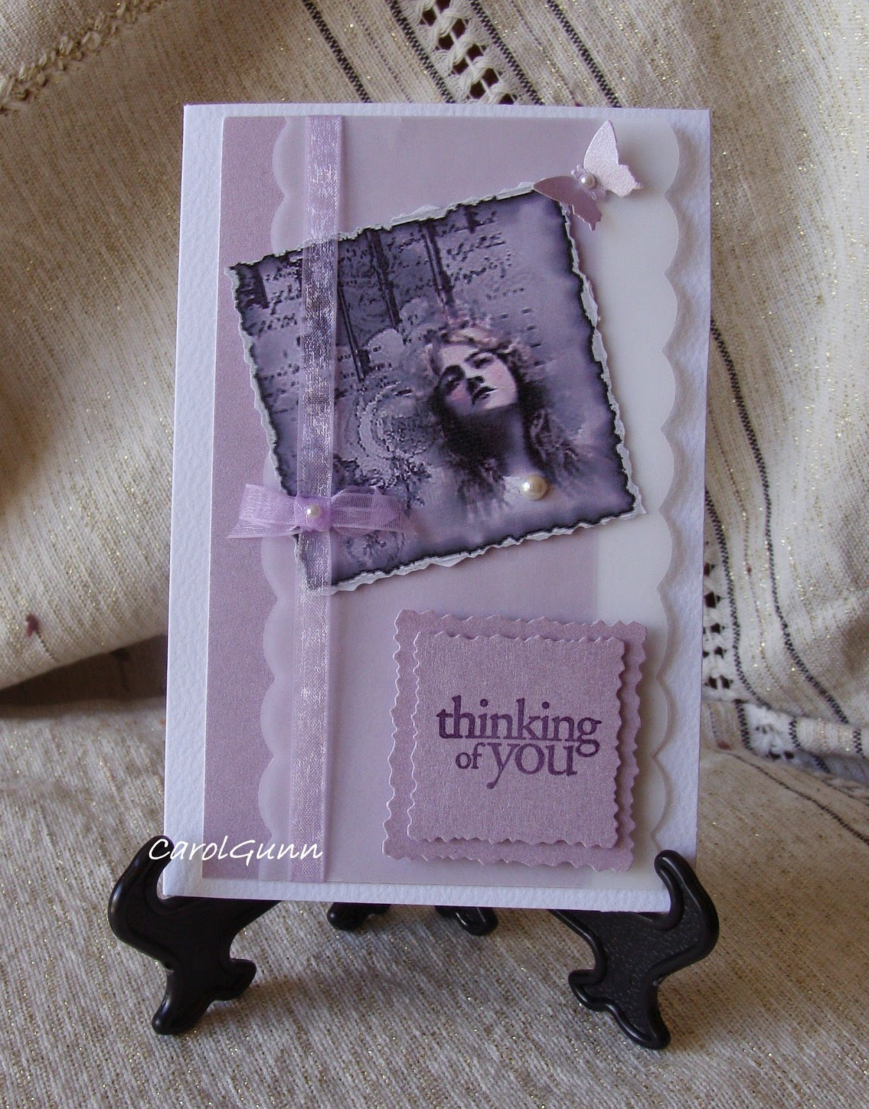
I like the colours in this one.  Initially I thought vintage had to be brown, but it doesn't have to be at all.  The purple card has a pearly sheen and there is vellum tucked in as well.

One thing I think needs to be mentioned is the stamps or font for sentiments needs to be of a suitable style that would have been around at the time.


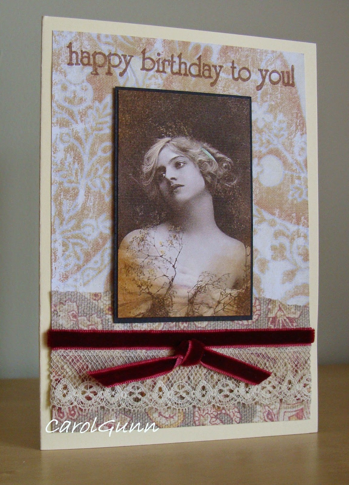
The trim and embellishments need to be appropriate too.  This one has a velvet ribbon and some vintage lace I picked up in a market. 


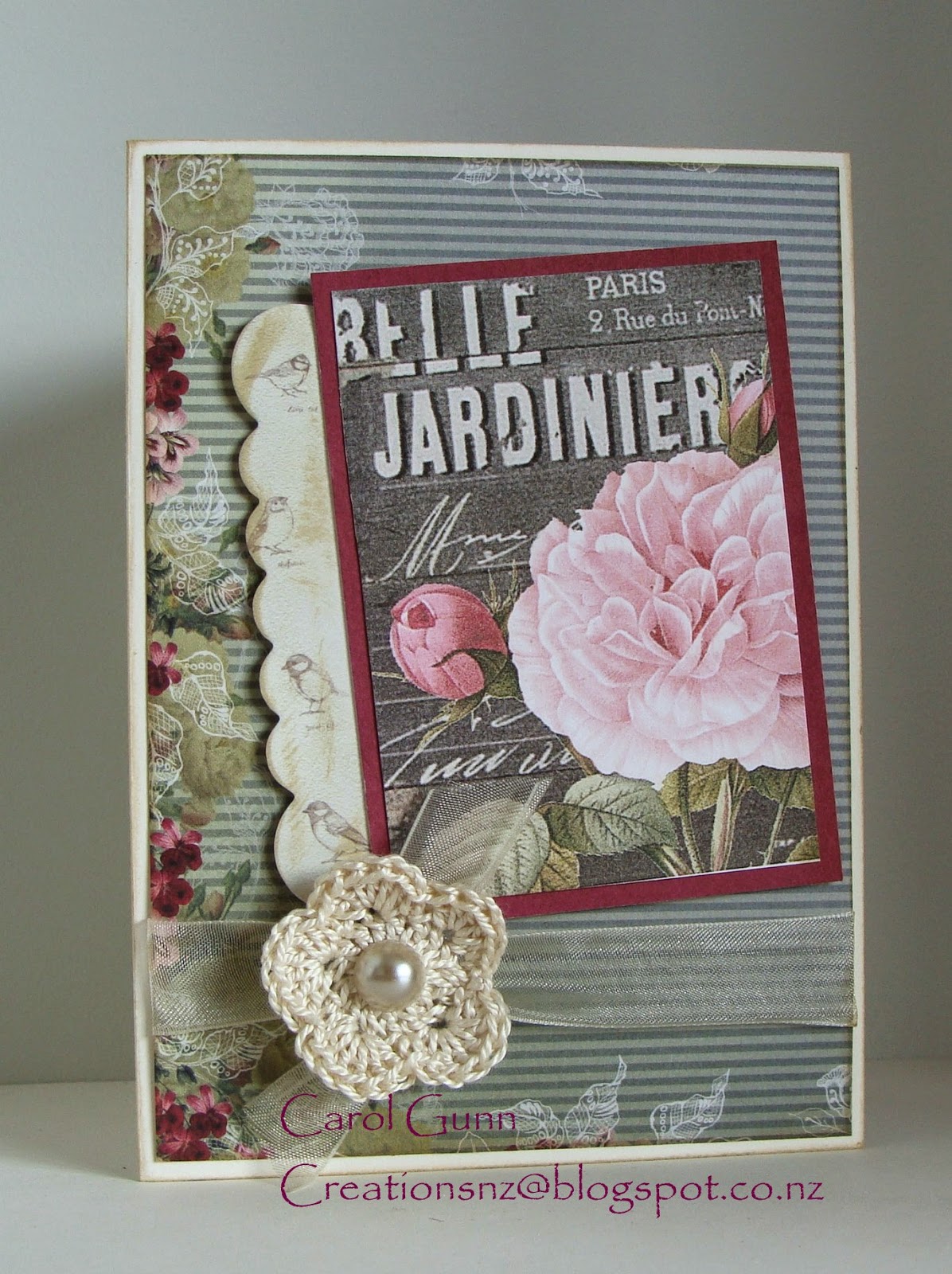
Subject matter varies a lot too.  Portraits of people to forms of transport can be found in sepia tones, but colour has a part to play as well.  I think we think of vintage as life being that colour in those days, but it wasn't - it was in full colour!


I wanted a flower to go on this card, but didn't want it to compete with the beautiful rose on the postcard, so crocheted a simple one myself, which I think added to the vintage-ness quite by accident.


I found the cups on some wrapping paper from a museum in UK and used it as the feature for this card. 

The brightish pink was quite a common colour in those days for ladies dresses.  A tiny doily behind the sentiment adds to the teatime theme without being too obvious.


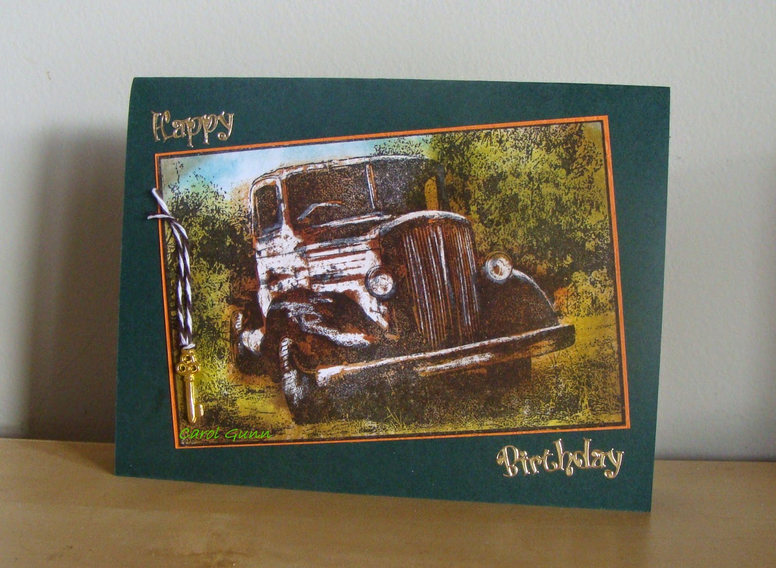
Old cars are a favourite for men's cards.  This old truck uses a wax crayon resist to highlight parts of the truck, and is then coloured with distress inks in a similar way to the old hand-coloured photos.


Some baker's twine and an old key add a little bit of touchability.


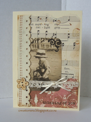
This image is stamped with sepia ink and the edges inked as well.  The embossed background is sanded for a rustic look and baker's twine tied around.  The photo corners were put on so it looked like it was in an old album.


There are many papers now that coordinate beautifully with vintage images.  I particularly love using script (either in papers or stamped), old ledgers, music (stamped or real old pages), and papers that look like old wall paper.  This one has the script, ledger and wall paper looking papers.


Finally what about the children? 


I love this stamp of  daddy and his little girl.  Lots of texture here with the black corrugated card, heavy hemp string, and the old looking label.


In this one I added blots and age marks to the old (real) music sheet, tore the edge a bit, and inked the edges.


Really, there are so many images around like clocks, watches, biplanes, sailing ships, typewriters, gears and cogs, pens, feathers, and old embroidery scissors, to mention a few.


I wonder how long it will be before computers join the list?  


Have a bit of fun trying out vintage themes.  And I'd love to know what you think of these.
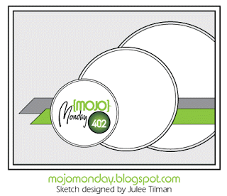