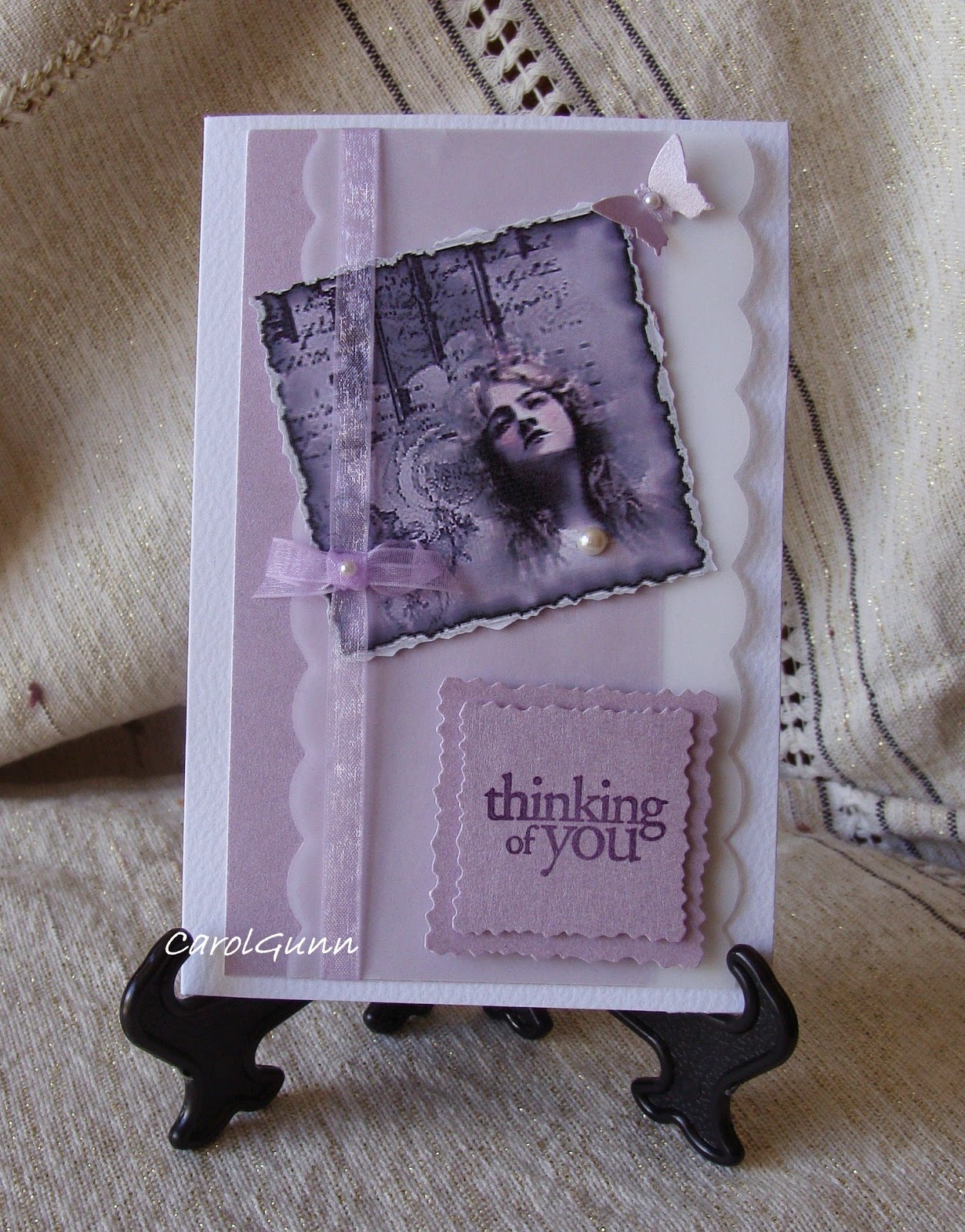
This is one of my early efforts. I used a download from a printable shop for the image. There are many different kinds available both free and for purchase. If you like vintage style, a basic set often comes with say 6 or 8 to a sheet.
I like the colours in this one. Initially I thought vintage had to be brown, but it doesn't have to be at all. The purple card has a pearly sheen and there is vellum tucked in as well.
One thing I think needs to be mentioned is the stamps or font for sentiments needs to be of a suitable style that would have been around at the time.
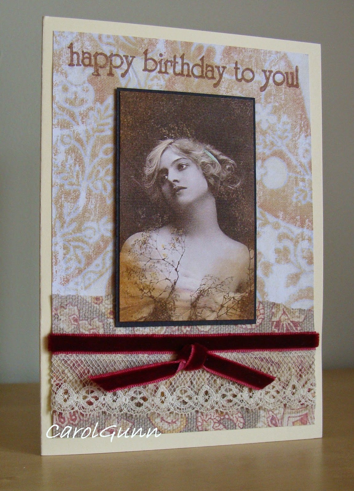
The trim and embellishments need to be appropriate too. This one has a velvet ribbon and some vintage lace I picked up in a market.
Subject matter varies a lot too. Portraits of people to forms of transport can be found in sepia tones, but colour has a part to play as well. I think we think of vintage as life being that colour in those days, but it wasn't - it was in full colour!
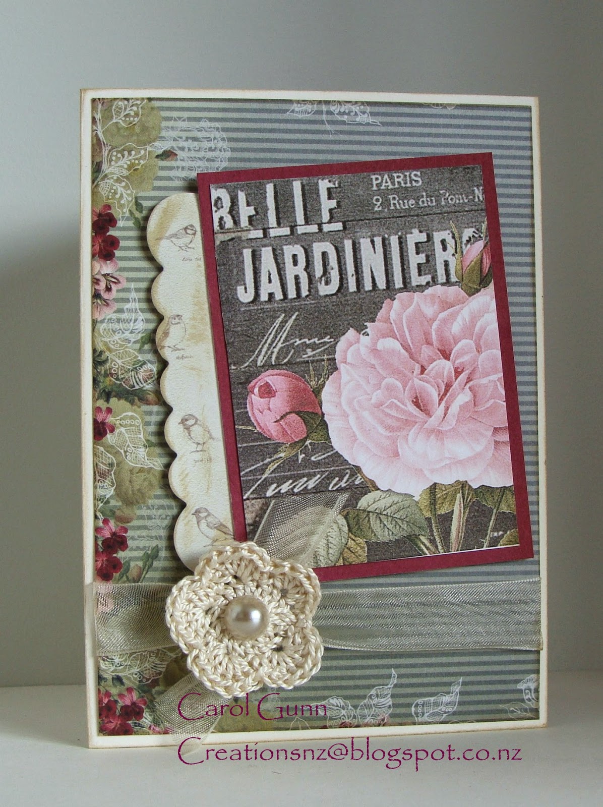
I wanted a flower to go on this card, but didn't want it to compete with the beautiful rose on the postcard, so crocheted a simple one myself, which I think added to the vintage-ness quite by accident.

I found the cups on some wrapping paper from a museum in UK and used it as the feature for this card.
The brightish pink was quite a common colour in those days for ladies dresses. A tiny doily behind the sentiment adds to the teatime theme without being too obvious.
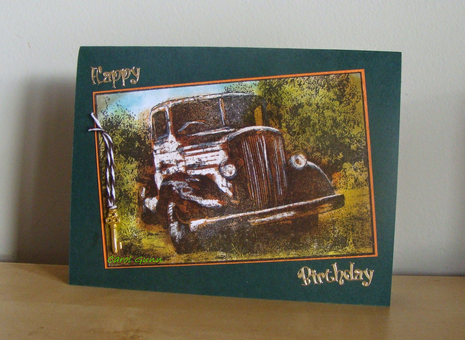
Old cars are a favourite for men's cards. This old truck uses a wax crayon resist to highlight parts of the truck, and is then coloured with distress inks in a similar way to the old hand-coloured photos.
Some baker's twine and an old key add a little bit of touchability.
This image is stamped with sepia ink and the edges inked as well. The embossed background is sanded for a rustic look and baker's twine tied around. The photo corners were put on so it looked like it was in an old album.
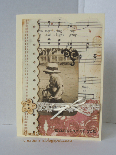
There are many papers now that coordinate beautifully with vintage images. I particularly love using script (either in papers or stamped), old ledgers, music (stamped or real old pages), and papers that look like old wall paper. This one has the script, ledger and wall paper looking papers.

Finally what about the children?
I love this stamp of daddy and his little girl. Lots of texture here with the black corrugated card, heavy hemp string, and the old looking label.
In this one I added blots and age marks to the old (real) music sheet, tore the edge a bit, and inked the edges.
Really, there are so many images around like clocks, watches, biplanes, sailing ships, typewriters, gears and cogs, pens, feathers, and old embroidery scissors, to mention a few.
I wonder how long it will be before computers join the list?
Have a bit of fun trying out vintage themes. And I'd love to know what you think of these.
