Translate

23 May, 2014

Move over cards, come in quilts

Hi there.
Quilting is more than you might think it is.  It ranges from bed quilts, to art quilts, and accessories, and also from traditional to modern-contemporary.  Have a look and decide for yourself.
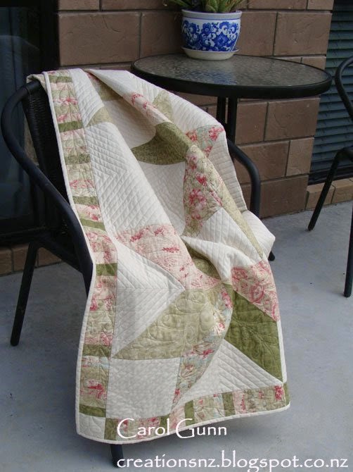
Over the past few months I have been concentrating on my quilting.  I have a lot of completed quilt tops known as UFO's in the quilting world - UnFinishedObjects.  Our local guild has a Biennial Exhibition in May so I decided to get some finished for that.
 I don't think I have a particular style, but it certainly is not hard-core traditional, and leans toward more contemporary style.  I love triangles in all their forms and am also learning more about stitching quilting designs.

I made this quilt top while we lived in the UK (2007-2009) and this influenced my choice of fabrics.  I used muted colours because the light is different there, and it seemed right.  They are certainly not New Zealand colours.  However I really enjoyed working with these colours at the time.
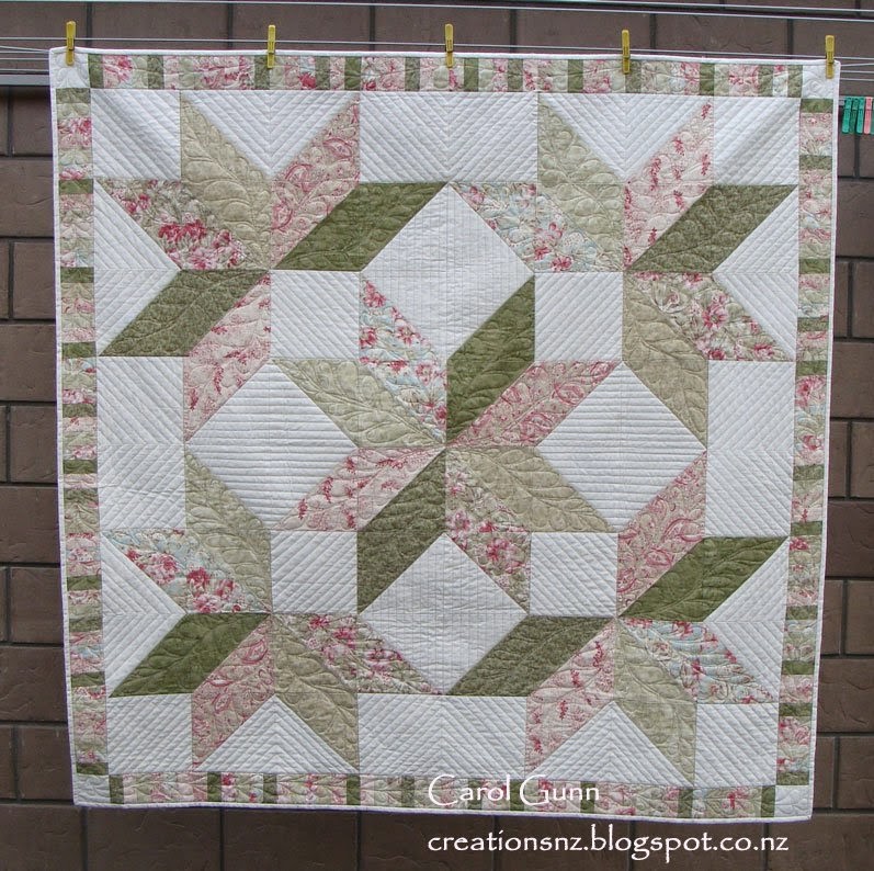


For this one, I tried quilting designs  I had never used before like ruler-work and feathers.  I did a lot of un-sewing along the way, but am very pleased with the result.

Leaking Cauldron pattern.


This is called an art quilt.  It still has the basic structure of a quilt (3 layers of top, batting, backing) but is constructed with freedom from a pattern and uses various other techniques and materials as the supporting act.
This is called "A Walk in the Bush", and is inspired by NZ bush.  The underlying geology, water, flora etc is combined to create a whole feeling of NZ bush.

Entirely my own design.
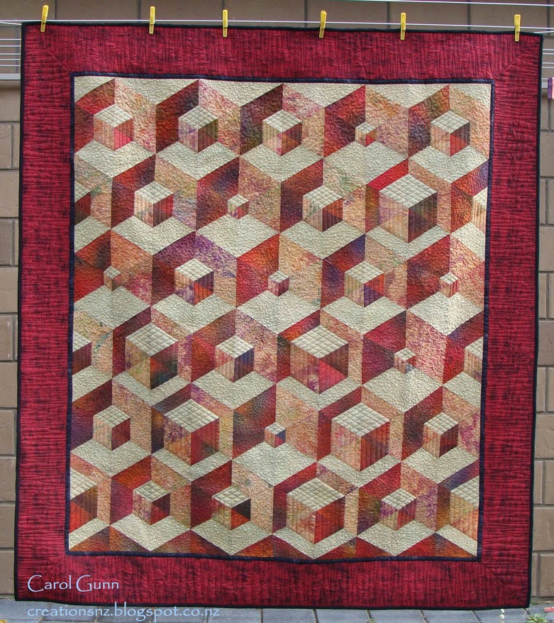


I made the top of this quilt and started quilting it a long time ago (maybe 2003 or 4) but only just finished it for the exhibition.
Originally I didn't even like it and put it away, I think mainly because they are not colours I personally like.  However I am glad I resurrected it.  The 3D image is really effective and I reckon it would look great in a building foyer where there is some space to see it properly.


Mary Jones pattern.


Sometimes we just like to do teensy projects after completing a big one, so I did some oven mitts for my daughter.

Martha Stewart design.


This is the second bed-quilt I ever completed.  I made it for my little granddaughter Rhiannon.  I like the off-centredness of this design which isn't too babyish and will still be ok when she is a teenager.
I guess the key thing for children's quilts is to make sure the backing is suitable for later in life, so it is able to be reversed when they grow up.

The techniques are piecing and applique.

I like this quilted handbag for dragging around my crochet projects, it sits upright and accommodates whatever shape is inside it. The wee triangles of colour are just there for "zing".  I love the bright lining too, it has inspiring messages on it and always makes me feel happy to look inside.

This is a pattern by a NZ company: Patches and Cream.


Another art quilt using batik fabric - Positively Purple.  This is kind of a free-cutting slice-and-dice technique it has patches of beading along some of the strips, which doesn't show well in the photo.


I hope this shows a little of the scope of quilting in the present.  Quilting is certainly not like it was even twenty years ago.
I like it when you leave me a comment, even if you don't like it.  Cheers, Carol.


28 January, 2014

NOT cards - January 2014

Anything but cards ...  albums, boxes and other stuff ...

Once in a while the other stuff shouts to be heard and even though it often uses the same materials as cards do, the result and the process may be quite different.

An album comes in many forms, from large to small, complex to simple. 
I have done a wedding album and didn't enjoy it very much, however I love the little accordion albums - they are my favourites!


This simple one was so I could focus on some positive things for the year, lots of goals, inspirational thoughts and reminders of the good life, after a stressful time...


... and this one, which is similar, has pockets along the bottom, to put samples in.  This is from a techniques class and each technique has been done on an ATC sized card for easy reference.  Each card has a description on the back describing the process.


Tags are another way of storing information and techniques or just for encouraging messages.  This is one I did for my daughter when she was struggling with the direction of her life.  Each side has an inspiring saying and are very tactile. I used lots of interesting textures such as handmade paper, vellum and tissue.


Jewellery box for men:
This is a balsa-wood box (very cheap at a discount store) which I covered with tissue (so it wrinkled) then painted with acrylic paint.  It looks like leather.  I added old poster clip art, diecut cogs, stamped slogans, gold leaf paper, and stick on brads.  Very manly I think, and my husband loves it.  Great for cuff links etc.  It is only 4" x 3", and came with that gorgeous clasp.


Boxes, both hard and soft always generate interest when containing gifts. I made a bunch of these at Christmas for giving cookies away.  Everyone loves a box with something in it. I could've just put the cookies in cellophane bags .. but hey, half the fun is not knowing what is inside!  I colour-coded the boxes so I knew what kind of cookies each box contained- everyone has their favourite cookie.

I used the Gift Box Punch Board to make the boxes.  The belly-band is Martha Stewart punch.


Another thing for a cute teeny gift are these TicTac wraps.  Sometimes I use the white mints and give them (especially to men) away at Christmas with the snowman poop poem on the inside. 
This one has Elfin poop with the fruity TicTacs.  I write the persons name on the front.
 
Rosette is Tim Holst diecut.
Pattern for wrap and poem from the internet.


Making things that aren't cards is a lot of fun and certainly extends that creative mind.  Have a go if you haven't already, I guarantee you won't stop at one!  Happy creating.


11 December, 2013

Wandering in ATC-land - December 2013

One of the great things about being a crafter is that you don't EVER just do one thing and stay there.  I started off when I was young with knitting and sewing, then progressed through pottery, batik, spinning, screen printing, cross stitch, drawing & painting, quilting, (and probably a few more I have forgotten about), then discovered cardmaking, which I thought was just like quilting except with paper ... and quicker.  However, once you get started on the crafting journey they all intertwine and some of the techniques are transferable across crafts.
 
For those who have never heard of them before, an ATC (Artist Trading Card) is a tiny work of art measuring 2 1/2"x 3 1/2", they are  always swapped (never sold) and come with details of the art and artist on the back.
 
One of the nice things about ATCs is that they are supposed to be works of art and as such are perfect for trying out some of the weirdest ideas you may have from time to time.  The great thing is ... they nearly always work.  Here are some I have done over a period of time and for all kinds of reasons (smile).


This is the first one I ever did (2010).  In a cardmaking group I am part of, we decided to have a go and started with the alphabet to make it easy on ourselves ...  so this is 'A' for angel.  ATCs are great for using up all those tiny scraps of precious papers like the heavy gold handmade paper I have never seen again since the day I bought it.


We continued on through the alphabet with some wild and wonderful creations, but this still remains one of my favourites.


I also had a swap going with Jackie from UK where we would take turns at deciding on a subject and make two every two months.  This one was to be inspired by a children's book or nursery rhyme or song.  I'm sure you can guess what mine were?
 
 Half the fun is thinking about what to do, and then knowing that you could keep going forever without running out of ideas ...


The thing is ... they can be 3 dimensional, have pull out bits, lift up bits, yarn, or openings:
 
It's also a great way to find other ways of using what you already have, especially stamps.
 
 
This was part of the alphabet series "D" for doors.


This one was a challenge, the topic was  "framed" , and while I did do some with the conventional frames,  I thought this was a fun take on the subject.


Talking about ATCs that are more than a pretty picture: this one is Open for Owls, another little bit of fun. 
The hard part was getting the hole punched in just the right place for the owls eyes to look through!


Newsprint or pages from books, painted, inked, stamped etc - a great way to get messy in a small way!   Sometimes I make ATCs to use as toppers on cards, and often they will need to be made slightly differently for that purpose.  These would be fine to use for toppers.


Textures was the theme of another swap with Jackie.  For the one on the left, I typed out fragments from papers and put them together randomly, using the red print to make another play on texture.text you're.  
It was really nice to play with the wire too and I just love that darn yarn!


Zentangles are great for ATCs, but need to be kept fairly simple.  Lovely to do in front of tv on a cold night.


And then lastly these are ones I have just made for our New Zealand swap group, on the theme of the Twelve days of Christmas. 
 
Have a go if you haven't already.  They are lots of fun, and can be as simple or complex as you want.  And really, use up all those precious wee bits that are hard to throw away.  Find someone or a group to swap with - a great way to get to know people too.
 
Thanks for having a look at my work through the year, hope you pop in again in 2014.
 
Have a cheery and safe Christmas,
Carol


08 October, 2013

October 2013 Summer is coming!

SUMMER is coming (in my part of the world anyway), and I decided to get out a few papers and card and make a series for one of my customers - a surf club.  I limited myself and some of the papers had a lot of variation over the face of the paper, so that when I cut it in half ... it looked like a completely different paper!  And I used just about all the bits too.


This one has stamped footprints wandering along to give it some movement and a starfish made from homemade paper which is very thick and textured.
Doesn't it look hot and summery?

I like using black base cards and especially with bright colours as it seems to make them look even more intense.


This next one is the other half of the paper I used above - you can just see the grey edge.     The surfer and tree were already embossed on the paper, the jandals & feet are diecut (provocraft), and the strip is punched (Fiskars 'In Stitches'). 


One of the signature fundraisers for the surfclub is Jandal day - hence the jandals as a recurring theme.  For those who don't know what jandals are, you may know them as thongs or flipflops.


One of the great things about summer is the colour and intensity - I love the yellow and turquoise in this card, then just the pop of red to bring out the text.

The turquoise zigzag is using a strip embossing folder then cutting it out, the yellow zigzag paper is double sided with a really ugly floral on the other side.


You will notice the strips I have joined together - they are left overs!   Use up tiny bits by combining them into something bigger. 

The chicken netting die is Dienamics.  To me, because of the colours, this one looks like it has a mexican flavour.


Beige can be dull or it can be something that makes other things look great. 

In this one I used it as sand and to make the coral and turquoise stand out.  I love that dotty paper which has some dots embossed and some not (I must remember that when I am doing my own embossing).


Hot-hot-hot and more of that dotty paper!
The blackboard looking paper was from another half and I just trimmed it so you couldn't see it was part of one of the other papers (who says we can't be sneaky?)

How simple is this?


The one above is hot, this one is cool.  The image is already embossed and says 'don't be too fussy', so this one I kept very simple.


Not much paper left by now.  The text paper is banner cut and hung from the top with a knot.


I think sometimes we can get too complicated and forget that sometimes the paper speaks for itself,  so we need to remind ourselves to keep it simple and fun, use colours and textures to tell the story.   These sure do feel like summer to me.

13 August, 2013

August 2013 I love vintage

I love making vintage-style cards.  Sometimes I purposely start out with something else and it just becomes vintage all by itself.  There are heaps of vintage images out there, lots of embellishments and it's always an opportunity to use found objects or make your own.


Men's cards have plenty of scope and with the steampunk images you can make an interesting card that every time the person looks they will find something else.  This one has plan drawings for a vintage bicycle.  They didn't have staples or adhesive tape but used other means to hold things in place, like string, ribbons, brads and gum.


I love to make ladies cards and use laces and ribbons.  I think I was born with an old soul - I love the dresses, the hair, the different look of people from two hundred years ago.  This lace is vintage which I picked up at a village market in UK.  The image has a lovely feeling of grace and beauty that is typical of photos from this era.
I always try to use shapes and trims that would have been around then, or something similar that may be a modern version.


Flowers are a well used motif in vintage images. Ladies used to carry posies with them not just to look pretty, but to counteract the smells of the environment.  To some degree, gardening was also an acceptable pursuit of gentlewomen.  Think of images of people strolling in gardens, gathering baskets of flowers and leaves, and ladies adorning themselves with flowers in the hair or as a corsage, maybe at their waist or on their hat.


Vintage cars, extravagant moustaches, canes and top hats were very much a gentlemanly image.  Some stamp companies specialise in vintage images and produce very good quality stamps.  Sepia inks enhance the vintage look and there are sprays and distress inks available to 'age' images.  This card with the three gentlemen has old postmarks and punched photo-corners to help the vintage feel.  What we know as baker's twine, was really Bakers Twine, used to tie up paper-wrapped goodies to be safely carried home from the bakery.


For any printed words, I am careful to get fonts or script that has a vintage feel.  Modern writing and fonts look just that - modern.  There are plenty of old script sentiments and background stamps, as well as the printed letters.  It's so very easy these days with plenty of computer fonts to choose from.


Modern Vintage: Sometimes using vintage images in a modern way is fun.  the newsprint background stamp is modern depending what it's put with; the washi tape is modern, however the script on it suggests older writing.  The colours are more modern ... but are they? 


We see old stuff, clothes and other items, in museums that have lost their original colour and we assume that is what they were like.  The truth is that some of the gowns were vivid colours - yellows, purples, reds. Over time, because the dyes were not colour-fast, they have faded and as the fabric starts to degrade, they often look dull.  Crockery had bold, bright patterns.  Leather was dyed bright colours for shoes, or should I say pumps?  Carpets were bright colours, as were drapes, bedcovers and many other household items.
What a shame we only see them in an aged and faded state in museums.   I can only imagine what a ballroom must have looked like with all the beautiful coloured dresses, and flowers.  Men dressed like peacocks as well.    And they had live music, and colourful food.   They were captured in a sepia world by the early photographers, but certainly did not exist in a sepia world.

Maybe ... I should be making vintage cards that are more realistic and colourful?


05 July, 2013

Not using it for what it is supposed to be used for...

I enjoy having a dabble from time to time, trying out materials in ways other than they're "supposed" to be used.  Here is a selection that I've done; hope you will have a go at experimenting too.


This one is using distress ink pads stamped onto a plastic sheet, spritzed with water, then printed onto paper.  The colours I have used and the fact that it is a 2nd generation print give the soft pastel finish. Adding a little mica to the mix adds that bit of shimmer.  It makes a great background to stamp onto.


You know those little drop-out bits from diecuts?  This pear is made from them in a mosaic style.  Just goes to show that every little bit can be used.  The colours haven't been changed, but when the pear was finished I coated it with Reeves Iridescent Medium, which gives a pearly sheen finish and increases the depth of colour.  I thoroughly enjoyed the jigsaw part and felt very satisfied with the result.
 
A friend of mine and I challenge each other constantly, often with weird and wonderful things.  For this one I was sent a couple of pages from a magazine and had to use it to make a fashion item. This had me racking my brains for weeks and finally was inspired by a background I saw on the internet using words.  After making the high heeled shoe from the magazine pages, I typed up all the words I could think of that related, then re-fonted and randomly coloured them. The paper beads are made from the magazine as well, threaded onto wire and inserted between layers.
 
How's this for a bit of mancave fun?  I made this for the door of my husband's workshop.  A cardboard collage of textures and shapes purloined from the workshop (some Gib board tape, washers etc), covered with bits of electricians sticky-on-one-side aluminium tape.  The tape is applied, pressed down and around the cardboard and other shapes, delineated using an embossing ballpoint tool, a nail punch is used to make indentations.  Then it's painted all over with black acrylic paint which is then rubbed off, leaving just a bit in the low spots.  It looks like it's made from metal.  He loved it.  Very blokish.
 
 
I've also experimented with using coffee grounds to dye paper, running plants through the cuttlebug, and lots of others things, and almost always made an awful mess but inevitably had lots of fun.  A great way to lose a day or two!


05 June, 2013

Men.
Enough said.
But what about cards for men?  People often seem to get stuck when it comes to mancards. 
I find they are often the easiest to make, and can be very simple.

An easy recipe is:  topic, sentiment, colour, texture, masculine materials, strong shapes.


This one was for our teacher son.  It is essentially very simple - patterned paper background, free download picture, a piece of chalkboard card and a watercolour pencil to write the message on the blackboard.   So, the topic related to him, the sentiment was a math joke, no feminine colours there, texture in the blackboard card, and the shapes overlap to hold the design together.  Because of the background paper no separate sentiment was needed.  The birthday message was on the insert.


This one was for our other son who works in IT.  He is a much 'louder' personality as well which is reflected in the colour choice.  Texture is visual with 3d-ish looking background patterned paper and definition is via the stamped shirt and tie being lifted with deep  foam pads.  I always find a bit of metal, like the square brads, give a manly feel. 
 
The sentiment is heat embossed in silver which gives a bit of tactile interest.  I find people almost always run their fingers over heat embossing.
 
So, in this one it is the punchy colours and shapes that give it a strong masculine feel.


Men also like things they can play with.  So a paper origami wallet that acts as a card, but can actually used, is perfect.  In fact the website that I got this off says people can use it for a travel wallet.
This is great if you want to include a gift card or money as well.  This wallet was used to give a Christmas bonus.

Try push-and-pull cards, easels, or pop out ones. 


Making his dreams come true in the card is a good thing.  So if he is a fisherman, give him a big fish to hold...
 
... or a big truck or a shiny red motorbike to dream on.


In this card, the waves are the negative spaces of a button diecut, and the star fish are cut out of coffee card.


These two are quite plain and simple.


Most times, men like a laugh.  While it's poking a bit of fun, they will see the funny side, and when it relates to them they will remember it.
 
Texture is added by running it through the embossing machine with a zigzag folder.


Keep an eye out for funny sayings and often someone you know will come out with a classic line.  Just find something that will go with the line and you have a mancard!
 
Normally I wouldn't put ribbon on a mancard, but this one looks like road markings so it worked.  Brads or eyelets to embellish.


Metallic card diecut into tools, metal brads, a cut up tape measure, kraft card with a wood-embossed pattern.  The base card of this one is actually deep teal, which goes great with kraft.  Handy DIY men are fascinated by the tiny tools.  You can buy metal charms shaped like shed tools or gardening tools. 


Materials are often the key.  Try using suede, woodgrain paper or veneer, wooden buttons, leather (real or paper), twine, cord, twill tape etc. I use metal of any kind, so that could be metallic card, brads, eyelets, strips, drink can metals (which go well through your embossing machine by the way), flattened bottle tops, etc. Heat embossing, especially with gloss and metallics. Paper patterns to try are dots, plaids, checks, stripes, zigzags, clocks, cogs, etc.  Tear, scrunch, and fold paper.  This is how to get texture as well. 

For this card I used a miniature pack of real playing cards that they use on planes.
 
Colours can be anything really (although I would avoid purple and pink), and often neutrals (cream, grey, black/white navy) with pops of colour work well. I lurk in paint shops and get their sample cards which often include room combinations of colour which can be quite surprising and challenging (used for the wallet).
 
Look in men's clothing shop windows, hardware shops etc and you will get inspiration.  Also remember things like road works (colours - dayglo yellow or orange, hard plastic), building sites (metal scaffolding, signs), and car showrooms (leather and shiny buttons).  I love making mancards... and most men are just happy that you made them one.... 


25 May, 2013

Things in jars


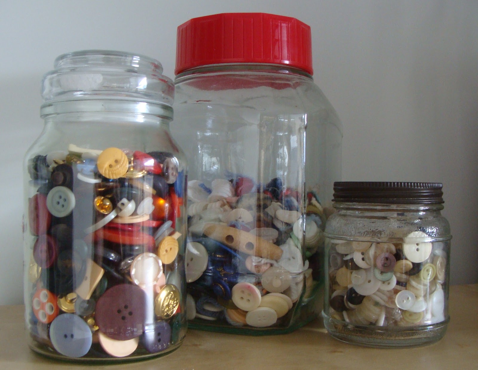
I have always loved jars.  I have jars (not a jar collection, you must understand) of various sizes and shapes, and I have a vintage button jar with inherited buttons which the grandchildren like to play with (who needs toys?). 


Think of this for inspiration.


I found a Mason Jar free clip art on the net and experimented with getting stuff in it.


First I tried photographing jellybeans.  This was fun, but I had to do it fast because they kept disappearing ...


For this one I made a shape card using the jar shape and filled it with my photographed jelly beans.  I did this by printing the jellybean photograph, then overprinting with the jar clip art, then cutting around.  Then sticking it to a base card and cutting it to shape, then tracing around the shape and cutting inside the lines to make a shaped insert and ....  whew!


Then I filled this one with purchased
liquorice paper ... After taking this photo I covered the single sweet with Tim Holtz Clear Rock Candy which made it look sort of crusty-glazed.


Much less fattening than the jellybeans. 


And then a couple filled with
coffee ....                     
mmmmmm..mm...m


and my photograph of cashew nuts ...  brown card cut with decorative scissors and sanded to distress.

Imagine my joy when I discovered this Hero Arts sentiment stamp!


                      ......my photograph of Snake Sours ...  unfortunately these kept diminishing too. 
I used clear glitter on the cutout sours to make it look like sugar.


Some spiders I photographed ...  one of the models crawled onto the card.  The background was embossed, smooshed with embossing ink, then clear heat embossed.


And lastly, what I set out to do - my button collection in a jar.  At least these are sugar- and fat-free!


I hope now maybe you'll look at things in jars in a different way.

Cheers,
Carol